


Candlesticks are used for charting price action by displaying the high, low, open and close prices for the time period specified. Depending if the candlestick closes higher or lower from the opening price, it will have a different color, usually either red or green where red marks a down candle and a green marks a candle that closed higher.
They can be displayed in different time frames, from a monthly and daily chart all the way down to less than a minute of data.
Candlesticks are great at showing market sentiment with long green bars closing near the high representing a bullish candle and a long red bar closing near lows representing a bearish candle. Candlesticks are also great at showing reversals by showing a long wick either on the top or bottom of the candle.
If prices run up in a candle but sellers took over and drove prices down there would be a big wick on top of the candle which could mean prices are about to head south. But like all indicators and tools, they should be used with other indicators to confirm price action. For instance, a reversal candle won’t be as effective if it isn’t at a major support/resistance level and volume is light.
Anatomy Of A Candlestick
Each candlestick is packed full of pricing data and that data is displayed through the candlestick on the chart. The candlestick is composed of a wick and a body based on the high, low, opening and close of that time period. Looking at the picture above you will see that prices opened at the low part of the body, sold off to the low and then buyers stepped in and bought it up to highs where sellers brought it back down to the close at the top of the body.
This is an example of a candle that is full of both buyers and sellers resulting in indecision, and can sometimes be viewed as a reversal candle if it’s at the top or bottom of a trend. Notice this candle is green, meaning prices closed above the opening price. If it would have closed below the opening price then it would have been colored red.
Candlestick Patterns
There are a ton of different trading patterns with candlesticks but a couple of the most popular include: bullish/bearish engulfing pattern and the hammer candle for reversals.
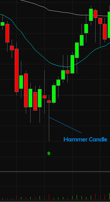
In the above example you will notice that prices were trending down when a hammer candle formed with an uptick in volume, creating a long wick. This shows that prices were sold off and then were quickly bought back up again as buyers stepped in. The next candle broke the high of the hammer candle and the trend was reversed.
These are easy to spot on a candlestick chart but an important factor to trading these reversals is the volume. If there is light volume on the hammer candle, then there isn’t much conviction that prices are going to reverse and is therefore best to stay away. In this example there was a slight pickup in volume but you normally would like to see double the volume of the previous candles.

The engulfing pattern forms when there is a candle that is totally engulfed by the next candle. In the above example we have a bearish engulfing candle that opened up above the previous candles high and closed below its low.
That indicates a strong move to the downside and is likely to continue over the following days. This pattern works best when prices are in a trend and then this pattern forms at a peak. This means there is a high probability that prices are about to reverse.