


When Welles Wilder published New Concepts in Technical Trading Systems in 1978, he released a series of new indicators and concepts that took the field of technical analysis to another level. Out of the myriad of ideas in his book, none is more well-known or used than the RSI indicator (Relative Strength Index).
The RSI is also one of the indicators people first learn about; it is undoubtedly the first momentum oscillator people learn.
Mr. Wilder bounded the RSI to a measurement of 0 to 100, and he assigned a static overbought level at 70 and an oversold level at 30. The calculation itself is simple and readily available in many pieces of charting software. Computers make these calculations now, but in Mr. Wilder’s book, he gave a worksheet because most charting was still done by hand.

The first lesson taught to new traders and analysis with the RSI is how to trade the overbought and oversold levels. New traders and analysts are taught that when the RSI reaches 70 or higher, it is an opportunity to scale out of a long position or consider a short position.
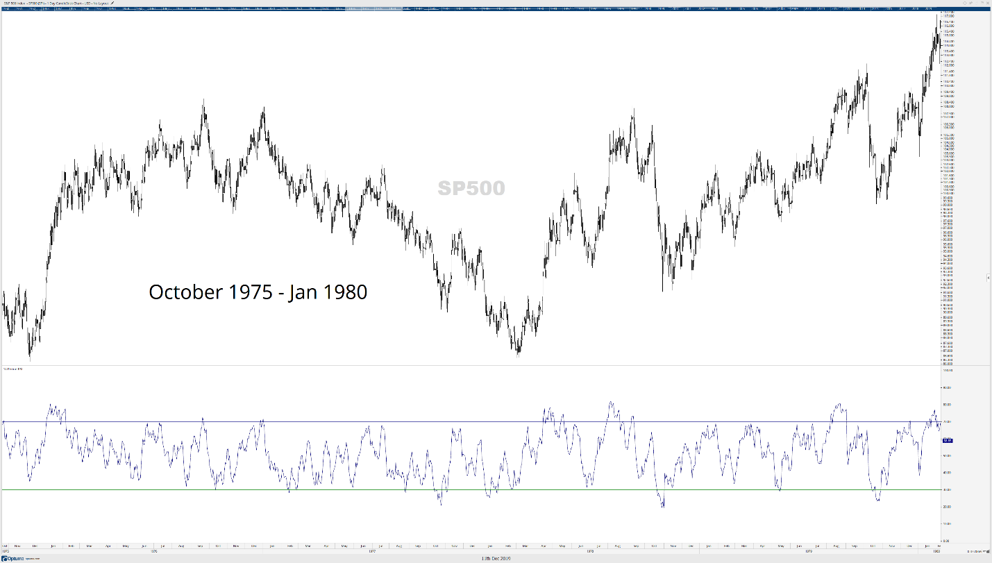
If the RSI drops to 30 or lower, then it is an opportunity to cover a short position or open a long position. It’s important to understand that the RSI was designed at a time when markets were very much range-bound. The image below is the S&P 500 from October 1975 to January 1980.
From this perspective (look back further to 1940 to 2000 and see the extensive ranges that occurred), the RSI looks like a powerful tool. The suggestion that buying an oversold RSI and selling an overbought RSI seems like a reliable and profitable strategy. But a lot has changed since 1978.
The “Upgrading” of RSI Indicator
One of the most excellent contemporary technical analysts is Constance Brown. Her work has influenced more changes in the approach to modern technical analysis and the updating of original theories than almost anyone else in the field.
Her work in the specialized field of Gann Analysis is second to none. Brown calls to attention an unfortunate condition with the majority of technical analysis information that is available to the retail investor and analyst.
New traders and analysts are using outdated information and using it to the detriment of their accounts. In her book, Technical Analysis for the Trading Professional (required reading for the CMT exams), she makes the following statement:
“Do not lose sight of the fact that the original works provided us with the foundation on which our industry is growing today. The important distinction is that early books on technical analysis will eventually be viewed as classics, but traders who fail to evolve beyond these original concepts face a far less pleasant fate: extinction.” – (Brown, 2012, 6)
You’ve probably noticed that the RSI seems to perform better when you do the opposite of Mr. Wilder’s first suggested use of the RSI. Why? Brown solves this by applying these rules to the RSI according to the overall trend (on any time frame):
- Bull Markets: In a bull market, the RSI ranges between an overbought zone of 80 to 90 and an oversold zone/support of 40 to 50.
- Bear Markets: In a bear market, the RSI ranges between an oversold zone of 20 to 30 and an overbought zone/resistance of 55 to 65.
New RSI settings in a Bull Market

The above chart is a daily chart for Microsoft (MSFT). Compare and contrast updated RSI settings by Brown (left chart) versus the default RSI settings (right chart). How does this principle work during intraday time frames? Let’s look:

The chart above is a 5-minute chart for Microsoft with the updated bull market RSI settings by Brown. It’s almost uncanny how often the lower bounds of the Microsoft’s 5-minute chart are limited to the newer oversold/support levels between 50 and 40.
New RSI Settings in a Bear Market

The Pan American Silver Corp (PAAS) daily chart above shows the difference between the new RSI settings in a bear market versus the default settings. The upper bounds of PAAS’s chart on the left show clear and consistent oversold/resistance levels between the 55 and 65 zones with overbought being found at 23 to 30.
The default RSI settings on the right chart don’t provide nearly as many trading opportunities due to the limited bounds of the original settings. Now let’s see what happens on an intraday time frame.

Apple’s (AAPL) 15-minute chart shows a temporary bearish market with some significant selling pressure. Observe how the 55 to 65 zone creates the primary overbought/resistance level, and the oversold area at 20 to 30 finds consistent bounces out of that zone.
Applying the “Upgraded” RSI Indicator
While the new overbought and oversold conditions are game-changing, that doesn’t mean that Wilder’s other components of the RSI are voided. Divergences still exist, and the positive expectancy of those divergences can be increased.
For those unfamiliar with divergences, they are powerful analytical tools that can help identify ‘dishonesty’ with the price action. Divergences can give traders a heads-up when a bullish or bearish swing may reverse.
Hidden Divergence tells us that the trend will continue – think of Hidden Divergence as proof or verification of a pullback/throwback. Divergence can turn a lagging form of analysis into a leading form of analysis.
Bearish and Bullish Divergences
We identify bearish divergences by comparing the highs on the price chart against the highs on the RSI. If price creates new higher swing highs, but the RSI is creating new lower swing highs, then that is known as bearish divergence (sometimes referenced as Regular Bearish Divergence).

If we observe price making new lower swing lows, but the RSI is printing new higher swing highs, then we see bullish divergence.
Hidden Bearish Divergence: Hidden divergences do not mean something is sneaky or hiding – instead, it is hiding the fact that the trend is going to continue. They should only be used as an analytical tool or trade tool if the hidden divergence is part of the dominant trend. A hidden bearish divergence occurs when price creates lower highs, but the RSI creates higher highs.
Hidden Bullish Divergence: Just like with hidden bearish divergence, hidden bullish divergence is only relevant if the dominant trend his up. To identify hidden bullish divergence, we need to see prices creating higher lows while the RSI creates new lower lows.
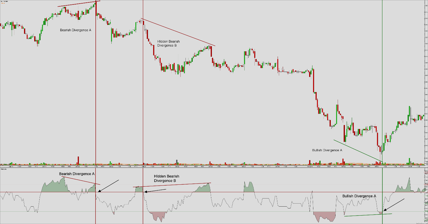
I know the question you are probably dying to get answered is this: How do I make money with this information? Let’s go over that now. The chart above is GE’s 15-minute chart. I’ve drawn a series of diagonal lines indicating where certain divergences are present on the chart, red to represent bearish divergences and green to represent the bullish divergence.
A method that is very useful in determining whether to go long or short is to wait for the RSI to cross one of the new overbought or oversold levels. The red and green vertical lines represent where the RSI has crossed above or below one of the new overbought or oversold levels – arrows are also pointing to crossing events.
But we can add another piece of analysis to help filter the RSI as a trade entry tool, and that is with moving averages. Listen: I abhor moving averages in trading – I believe that moving averages are used to lure people into a false sense of knowledge and understanding.
Moving averages and the corresponding trading system associated with moving averages have been the bane of many new trader’s accounts (s). However, in this case, the application of moving averages in trading strategies is not on the price chart, but instead on the RSI itself.
The chart above is still GE’s 15-minute chart, but the particular trading date has moved further to the past. The RSI below is set for a bull market. Observe the moving averages applied to the RSI – they are moving averages of the RSI. The green represents the fast moving average, a 13-period moving average of the 14-period RSI (confused yet).
Don’t let the wordiness of what I just wrote confuse you.
The red moving average is the slow-moving average, a 33-period moving average of the 14-period RSI. I’ve placed a series of vertical black lines on both the price chart and the RSI. The vertical lines represent a period when the RSI (black line) crosses the fast (and/or slow) moving average.
Notice the reaction price has when these crossovers and cross-unders occur. Especially note how powerful the signals are when the crossover or cross-under occurs when the RSI is moving out of an overbought or oversold condition.
Final Thoughts
A short article does not do justice to the work that Connie Brown has contributed to this study and I would encourage everyone to pick up any of her books, especially Technical Analysis for the Trading Professional, her most recent book The 32nd Jewel, and Fibonacci Analysis.
If I had more time, I would have liked to delve deeper into the more of the flaws of the RSI and why Connie Brown created a new indicator to address the RSI limitation: The Composite Index. That will be for another article at another time.