

Technical analysis is a loaded term.
The phrase means different things to different people. If you ask a green pea newbie, they’ll tell you that with the right knowledge of chart patterns, you can accurately predict the stock market and make billions of dollars.
Ask a skeptical value investor and they’ll call technical analysis tea-leaf reading and compare analyzing price charts to using moon phases to predict markets.
So let’s get clear on what technical analysis is.
If you ask me, technical analysis is the use of market-generated data to forecast future market moves. Market-generated data is a pretty broad term, but it mostly boils down to analyzing how the price of an asset moves, and how much of it trades (volume).
Most trading and investing methodologies fall into two camps: technical analysis and fundamental analysis.
Technical trading and investing concerns itself with what the market does.
A good analogy is that a technician doesn’t study a company’s actions, but how the market reacts to those actions. Technican’s main tools are price and volume and their chief goal is to identify supply and demand imbalances.
Fundamental trading and investing concerns itself with the asset itself, and not it’s trading patterns. A fundamental investor wants to know how competent management is, how sales are growing, how much profit the company makes from each transaction, and so on.
Most people think that technical analysis means using charts to trade and this is a misconception.
While most technicians do use charts, they’re just a tool. Technical analysis is just a catch-all term for traders who use a variety of approaches to measure supply and demand imbalances.
It doesn’t matter if you use order flow data, charts, or use an algorithm to buy stocks in uptrends, the goal is the same.
Why Traders Need Technical Analysis
If you ask me, you can’t be a short-term trader without applying technical analysis.
Sure, fundamental events create short-term price movements everyday, but if you’re not a high-frequency trader, you can’t capitalize on the information before the rest of the market gets there.
The fundamental catalyst might give you a directional bias, but now you need to use technical analysis to trade your thesis or else you have no reference point.
Let’s take a simple example to explain why traders need technical analysis.
Suppose you think Shopify ($SHOP) is going to outperform the market’s earnings expectations. Sure, without technical analysis, you can simply buy the stock and wait for it to increase.
But, how do you know when to sell?
Do you sell into the initial earnings pop? Sell a week later? What if you’re wrong and Shopify misses or performs as expected?
For technical traders, these questions are easy to answer. They usually set predefined stops and take profit levels, or let the price action guide their decisions. They typically base these levels on support and resistance zones.
Steve Nision, who wrote Japanese Candlestick Charting Techniques, is credited with popularizing candlestick charts in the west. Nison argues that candlestick charts reflect the psychology of all traders and investors in a given market.
Without paying attention to charts, you’re not allowing the market to tell you where it thinks it’s going.
Technical Analysis: Bottom Up vs. Top Down Approach
Whether you’re a trader or investor, chances are, your style of choosing trades/investments is either bottom up or top down.
Top Down Technical Analysis
It’s in the name–start from the top to choose your trades. Top down technical analysis concerns start from the indexes, and move down to sub-groups.
A top-down stock trader will first look at the major indices: the S&P 500, Russell 2000, and Nasdaq 100. If a top-down trader identifies an attractive setup in one of the indexes, they will then look at the sub-groups within that index.
Let’s illustrate this concept visually.

In the above chart, we have three major US indexes. It’s clear that the Nasdaq 100 not only has significant positive momentum, but is outperforming the other two indexes handily.
Now that we’ve decided to focus on the Nasdaq 100 stocks, we can narrow down further by looking at the performance of each sector.
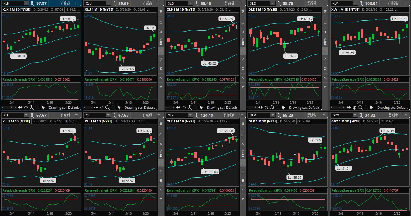
By the looks of it, the technology sector (represented by XLK) is the strongest sector currently. This filters down our choices to a short-list of stocks: tech stocks within the Nasdaq 100.
We can optionally narrow our search down even further by looking for the best performing technology sub-industry. FinViz.com’s Map Tool is excellent for this type of analysis.

By the looks of it, the average performance application software seems to be the strongest. This gives us a highly filtered list: Application Software stocks in the Nasdaq 100, which is only seven stocks:
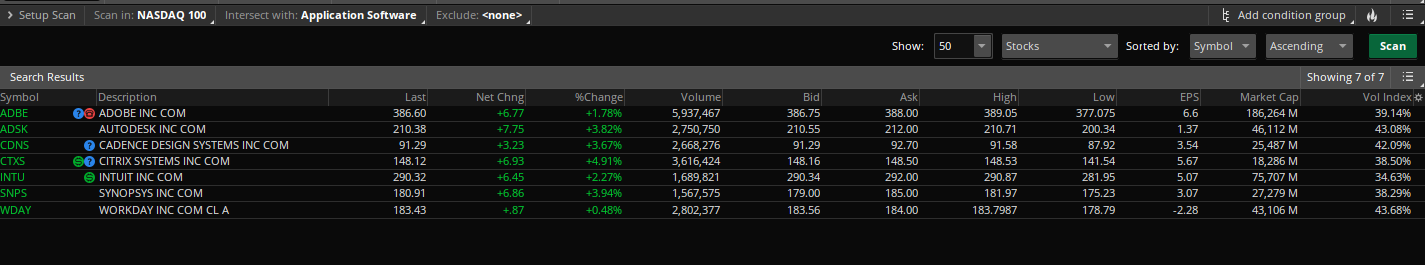
With such a filtered list, we can analyze each stock individually, with no need for further screening.
Bottom Up Technical Analysis
Bottom technical analysis is simpler and easier than top-down TA, but it comes with drawbacks.
Bottom up TA involves looking for trade setups at the individual stock level. Perhaps you’ve spotted a stock on a Gap Up screener.
A bottom up technician is relatively unconcerned with how that stock’s industry and sector indexes are performing that day. They know that there’s a supply or demand imbalance and want to trade that.
The benefit to bottom up trading is you set less restrictions on yourself. If there’s a setup there, you trade it. However, there’s some benefits to top-down TA, the main one being is you always have the wind at your back.
Key Technical Analysis Concepts
A technician is never truly an expert, if you join this business, be ready to subject yourself to a life of learning.
There’s a few key concepts to get you on your way to competence though. Without a proper understanding of these concepts, becoming a profitable trader is going to be an uphill battle.
Trends
Trends are the backbone of any profitable trading strategy. Trends are sustained supply/demand imbalances in one direction.
Talking in real terms, think about what a “sustained supply/demand imbalance” means.
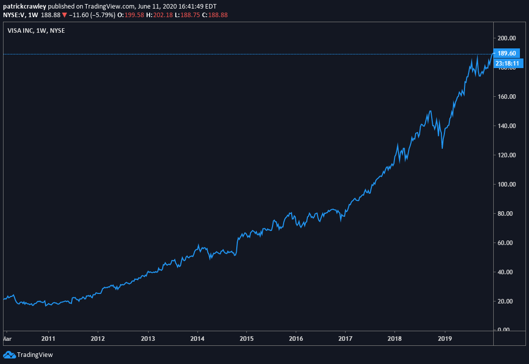
What is happening in the chart above? It’s simple, over time, the demand for Visa’s stock has been higher than the supply. Hence, the price must rise so that sellers can meet the demand. When this happens over a sustained period, that is a trend.
So, instead of thinking about charts when you hear the word “trend,” just think that either bulls or bears have been moving the market in one direction consistently.
Quantifying Trends
Identifying a trend is straightforward: look for a series of higher-highs and higher-lows in uptrends, and lower-highs and lower-lows in downtrends. That’s the fundamental definition of a stock market trend.
But, it helps to move beyond elementary trend definitions as not all trends are created equally.
Some trends look like this:

And some trends look like THIS:
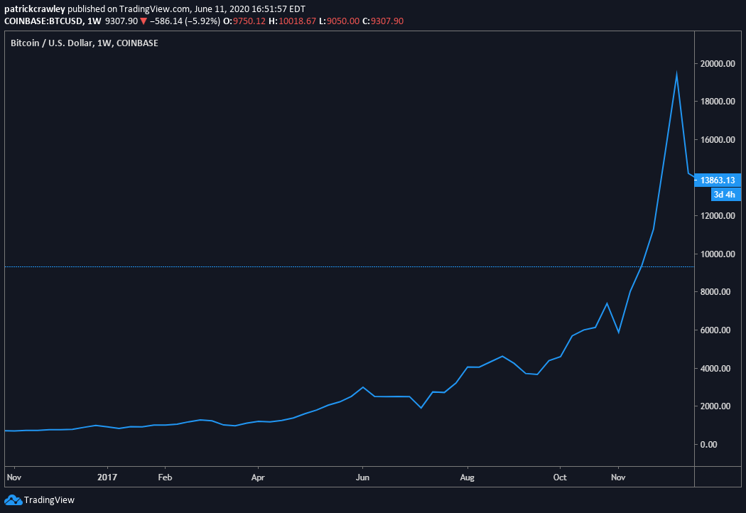
Put straightforwardly: stock market momentum is how fast price moves in one direction. Momentum is how you compare trends. Take the example of two stocks in uptrends. They’re both making higher-highs and higher-lows, however stock A doubled in the last three months, while stock B only advanced 5%. Stock A is exhibiting stronger momentum.
A high level of momentum implies bulls or bears are piling into the trade at a rapid pace, with little regard for the price they pay.
The strongest trends are accompanied by great momentum. The death of these trends typically occurs shortly after the momentum wanes. When momentum declines, the previous extreme price increases are no longer sustainable, and a strong counter-trend move is likely to follow.
The methodology used to quantify momentum differs from trader to trader. The accepted approach in academic and institutional circles is 12-month and 3-month returns. A simplistic ‘momentum factor’ portfolio would be buying the stocks with the highest 12/3 month returns at the end of the rebalance period.
When it comes to shorter-term technical traders, they trade momentum differently. By far the prominent technique is to use momentum oscillators like MACD or Stochastics to look for momentum trends.
Below is a chart of DocuSign (DOCU) stock with a MACD indicator for reference.

Momentum traders might use the MACD as a signal or as a convergence/divergence indicator.
An example of a MACD signal would be to buy the stock when the fast-line crosses above the slow-line, or when the histogram crosses above the zero-line.
Traders using the MACD as a convergence/divergence indicator analyze the indicator’s highs/lows compared with price highs/lows. When the two disagree, this is called a ‘divergence’ and is a signal of weakening momentum.
Some other useful tools for gauging the strength of trends are moving averages, volatility bands (Bollinger Bands and Keltner Channels), and other momentum oscillators like the Average Directional Index.
Support and Resistance
Support and resistance is one of the first concepts that novice traders learn about.
Put straightforwardly: support is an area of large buyer ‘support,’ when prices near this level, buyers begin to get more aggressive and buy in larger quantities, protecting price from declining below this level.
Resistance is the other side of the coin. Resistance is an area of significant seller ‘resistance.’ When prices near this level, sellers become more aggressive and sell in larger quantities, preventing price from advancing above this level.
By way of illustration, let’s imagine a hypothetical hedge fund manager who owns lots of stock in Company ABC that he wants to sell. Because he owns 5% of the company’s stock, it will take a few weeks to unwind the position. He directs his trader to sell between $8 and $10.
Each time the stock rises back to $10, the trader aggressively sells as many shares as possible, pushing the price back down.
This will continue to happen until all of the fund’s shares are sold. A resistance zone around $10 is created because at that price, there’s more supply than demand.
To demonstrate support, you can imagine a similar example in which a hedge fund wishes to buy a stock at a certain price, where each time the stock declines to that level, the fund begins to aggressively buy shares.
Overbought and Oversold
I like to think of stock prices like rubber bands. A rubber band untouched is pretty small, and it can be stretched quite far. But you can only stretch a rubber band so far before it snaps. This is a useful analogy for the idea of stocks being “overbought” or “oversold.”
These terms, overbought and oversold, are part of a greater stock market philosophy that many hold: there’s no bad stocks, there’s only bad prices. Proponents of this notion make a strong argument: maybe you think Tech Stock XYZ is a shoddy, money-burning company, but you’d probably buy shares at 5% of today’s market cap, right?
These beliefs can largely be summed up by one phrase: mean reversion: stocks (and other securities) have a “mean” (think of a trendline) that they tend to revert to over time.
Occasionally stocks deviate significantly from their mean, creating an opportunity to join the trade at a favorable price.
So far, this seems like a straightforward trading strategy: wait for a stock to deviate from it’s mean and trade the stock back to its mean.
However, this simplified view of mean reversion is where most traders and investors get into trouble. Have you ever been recommended a stock because the price fell recently?
I’m writing this in June 2020, just a few months after the coronavirus-related market crash in February 2020. I saw people recommending airlines and cruise lines based on this type of flawed analysis all throughout the crash.
Instead of this haphazard strategy, a more sound strategy is to combine the strengths of a mean reversion strategy with that of a trend following strategy. I can shorten this to “buying pullbacks in uptrends,” and “selling pullbacks in downtrends.”
Here’s an example of your typical “oversold” stock. The stock is in a strong, persistent downtrend. Its rallies are short lived and timid, and it’s drops precipitous.

Sure, the stock has dropped a ton. Some sort of short-term upward reaction seems likely, but that’s a low-expectation trade. Most stocks like these will continue to drift downwards over time.
Now, let’s look at a trade setup which offers infinitely easier decisions.

The above chart shows Berkshire Hathaway (BRK.B). The stock was in a steady uptrend on the daily chart, as well as lower time-frames; making higher-highs and higher-lows as well as continuously making new momentum highs (as marked by a MACD-type oscillator).
In this scenario, our trade direction is harmonious with both the short and intermediate-term trends. Remember what we talked about before–long-term trends indicate that big players are accumulating shares–there’s a supply/demand imbalance. It’s better to have the wind at your sails.
Bottom Line
Technical analysis gets a bad rep among value guys, who stick to the fundamentals.
However, the last decade has proven the effectiveness of technical analysis with the success of the litany of quantitative hedge funds applying technical analysis on a large scale.
While this article gives a good primer on the critical aspects to understand in technical analysis, you’ll find that travelling down the rabbit hole a bit is necessary to find your niche.
I’ll close with this excellent Jack Schwager quote:
“There are a million ways to make money in the markets. The irony is that they are all very difficult to find”