

An order imbalance is when one side of the trade (buy or sell) meaningfully outweighs the other side. As a consequence of supply and demand, a significant imbalance in one direction is bound to affect the price of that security.
Understanding Order Imbalances
The NYSE and NASDAQ both disseminate order imbalance information each day on their listed securities. Traders can use this data to either (a) position themselves on the same side as the imbalance, or (b) provide liquidity to the big orders.
Providing liquidity is a more complicated strategy, requiring more infrastructure than the average reader possesses, so it’s beyond the scope of this article.
Many large institutions like ETFs, mutual funds, and sovereign wealth funds either have to or choose to allocate most of their positions on the market close. This is why a considerable proportion of each session’s volume takes place precisely at the closing auction.
Each exchange’s closing auction is essentially designed to curb volatility, prompting these institutions to place large Market-On-Close orders.
Because exchanges disseminate imbalance data, there is a rush by arbitrageurs and market makers to provide the liquidity, which reduces the realized volatility of these large orders. A key aspect here, though, is that usually, only one side of the trade at the close is an informed participant; the other side is going to flip out of the stock shortly after the transaction.
There is immense value in studying the behavior of order imbalances, both on an individual stock level, as well as an industry or sector level. It’s one way of seeing whales accumulating a position over time and sometimes price under reacts because of the opportunistic arbitrageurs who are ready to provide the liquidity.
An order imbalance only shows up if the imbalance was more than 50,000 shares.
How To Get Imbalances Data
Not too long ago, imbalance data was pretty hard to come by, and it was pretty much agreed upon that you had to join a prop firm to get a direct feed. Nowadays, of course, things are a bit different, and several data vendors are willing to sell you an imbalances feed for a reasonable feed.
To my knowledge, the most accessible route to imbalance data is through Nasdaq TotalView, which is Nasdaq’s data feed for “serious” traders. It’s essentially level 3 data: they display more liquidity than your average level 2 window, odd lot orders, as well as Net Order Imbalance Information (NOII).
Unless you purchase a direct-feed from Nasdaq (expensive), you need to buy a subscription from a data broker. For a licensed data broker. On their website, Nasdaq lists their partners who can provide you access to NOII, in addition to the other TotalView benefits:
- Bloomberg Finance L.P.
- Charles Schwab & Co. Inc.
- Das Trader
- Eze Castle Software LLC
- FactSet
- Nasdaq Workstation
- Sterling Trading Tech
- Wolverine Execution Services
As a retail guy, I only have experience with three of those vendors: Charles Schwab, DAS Trader, Sterling Trading Tech. The former two require you to pay a hefty monthly fee, while Schwab offers it for free, so long as you make 30 trades in a quarter. With free commissions, it is essentially free.
However, I personally don’t see a ton of value in getting a direct feed of the imbalances, for reasons I’ll outline in the next section. I prefer to look at imbalances from an intermediate-term perspective, using them as a way to track the money flow of large institutions who execute a bulk of their volume on the market close.
A tool that I’ve personally found helpful is called Market Chameleon. They provide daily imbalances, but what I like is their net MOC inflows and outflows tool. It allows you to look at moving averages of the imbalances over more extended periods to track where the institutional money is flowing.
Why Day Trading Imbalances is Infeasible
In my view, trying to catch a couple of pennies by scalping imbalances isn’t an excellent strategy for the retail trader for a few reasons. At the core of this reason is that imbalances are pure statistical arbitrage.
These types of strategies are very quickly arbed away by automated traders. It’s become a game of speed: those with the fastest data feeds and execution get most of the pie. In essence, HFTs dominate imbalances scalping, so I prefer to take a different approach.
Before electronic markets were so advanced, everyday prop traders were able to take advantage of their massive speed advantage when the imbalances would come out. They would take advantage of the inefficiently priced limit orders sitting on the order book and successfully scalp the imbalances each day.
Nowadays, only the fastest firms with the best infrastructure can make money through imbalance arbitrage.
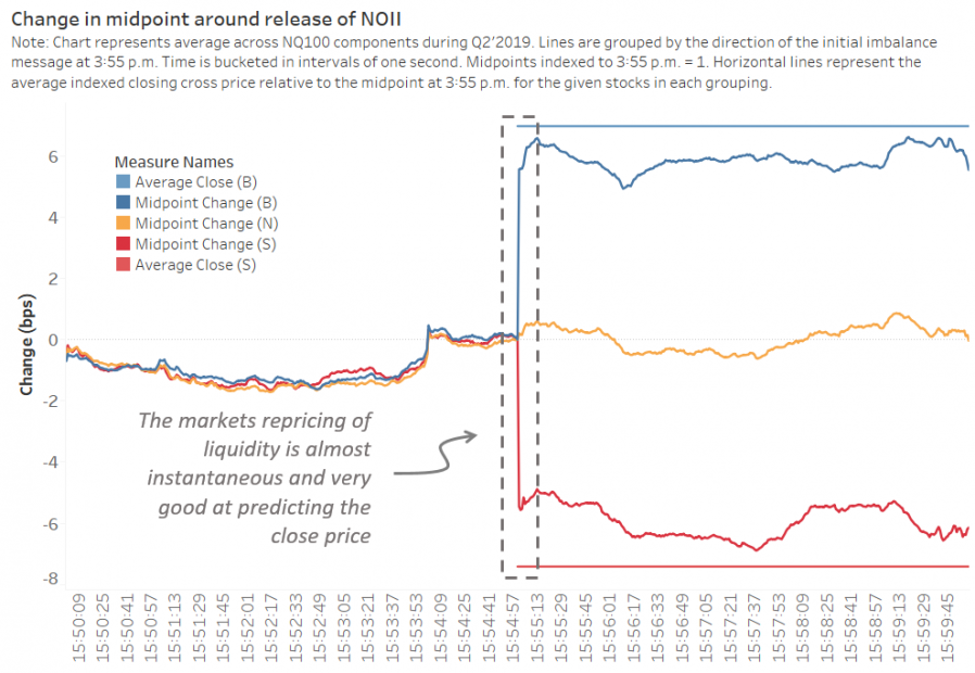
Here’s a chart from Nasdaq Economic Research which sums up what I’m saying here:
Using Imbalances for Swing Trading
We have to accept our role as retail traders. We have some structural disadvantages, like those I outlined above. But what we do have is our positional nimbleness. Because of our relatively insignificant market impact, we can quickly establish or exit positions. This nimbleness can come in handy if we want to establish the same positions as institutions.
I like to treat imbalances as a sort of stock scanning tool. Instead of trying to find a quick 1-minute chart in a stock that has a significant imbalance for that day, I like to look for swing trades that can last weeks to months, if possible.
Imbalances can key us into longer-term trends in the flow of funds. If, after weeks or months of regular activity in one sector or industry, we identify persistent imbalances on one side of the trade, we can infer that someone is building a position.
Combining this with an excellent technical setup can provide us with an excellent risk/reward. The most significant players can take weeks to build a full position.
Market Chameleon has a great tool that lets you plot a moving average of the imbalances in a specific sector or market cap. If I’d like to see the 20-day moving average of the net imbalances for natural resources stocks, I can do that.
Using this longer-term tool, I can spot trends emerging in the underlying supply and demand that can sometimes serve as a leading indicator, showing up before the move is made on the stock chart.
MOC Inflows and Outflows
Here’s an example of net MOC inflows and outflows of stocks within the financial services sector (using the components of the XLF financials ETF). As we can see, for the last several months, there has been substantial buying activity on the close in the financials, indicating that some funds were building positions in the financials.

However, very recently, that trend began to reverse aggressively, indicating that some big funds are liquidating a large portion of their financial portfolios. They could be reacting to small gyrations of the market, or they may know something that the rest of us don’t. The principle stands that it makes sense to follow the money.
What is interesting is that a sizable swing followed that large downtick in net MOC buy imbalances. If you look at the imbalances chart above, we can see that between January 21st and January 23rd is when the large downtick in the net buy imbalances took place.
Still, we didn’t see a significant price decline in the financials ETF (XLF) until January 24th, which lead to a further downswing.

Of course, it doesn’t always work cleanly, and even within this setup in the financials, we saw several upward pullbacks within the swing, so this one didn’t even work perfectly. But sometimes, changes in the average imbalances can lead the move.
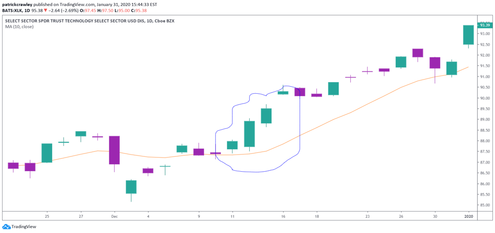
Other times, however, they’re not as cut-and-dried. Let’s take a look at a move in the tech sector that was a bit less clean, and perhaps wouldn’t be as evident of a trade to make.
Below is a graph displaying the net MOC inflows/outflows of stocks within the XLK technology ETF.
If you look at the dates between December 11th, 2019, and December 13th, 2019, we can see a significant uptick in buy imbalances, almost taking the 20-day average over the zero-line in just three trading days.
Then, over the weekend, we saw another sizeable one-day uptick in the buy imbalances, taking the 20-day average over the zero-line.

Now let’s take a look at the XLK ETF and see how price reacted. As you can see, during the initial uptick in the buy imbalances, the price responded along with it, and the market made a pretty sizeable move on December 12th, 2019. It wasn’t very easy to assume that the market would continue to trend upwards, because a decent move already occurred.
As you can see on December 16th, 2019, the market gapped up. Significant buying activity was taking place, which contributed to the strength.
Bottom Line
As you should know, there is no holy grail in markets. Everything has flaws and drawbacks, but some things are better than others.
A significant drawback of relying on the net closing imbalances as a money flow indicator is that it only looks at closing transactions, and only records imbalances in stocks with an imbalance in excess of 50,000 shares.
So, we don’t get an entire picture. I’m not sure someone can trade just the imbalances on their own without combining another market timing or filtering tool.
For example, I don’t think it’d make a whole lot of sense to buy a falling-knife (like an energy ETF at the time of writing) just because you see significant institutional buying. I would want to see a technical signal coinciding with that because the imbalance signal on its own isn’t strong enough in my opinion.