

Reversals are something that every new and veteran analyst/trader looks for. They represent early entries with excellent risk/reward potential. But like the search for the most profitable trading system, searching and identifying reversals can be a great way to kill your account.
But reversals are also an essential setup pattern for adding to positions, initiating new positions, and generating countertrend trade setups. A significant amount of technical analysis involves the interpretation and identification of reversal patterns.
As a full-time trader and educator, I’ve noticed that the predominant chart style focus for new traders is Japanese candlesticks. And I think the industry would do better by new and aspiring traders/investors by going, literally, back to basics.
Japanese Candlesticks
Before Japanese candlesticks, the American bar chart was the default chart style. Japanese technical analysis is very different compared to Western analysis, and in other ways, it is very complimentary.
Some of the earliest examples of Japanese candlesticks are from the 17th century, pre-dating the Meiji Restoration, and certainly pre-dating the use of American bar charts (the 1880s). We also need to understand that Japanese candlesticks are a very advanced form of technical analysis.
And I believe that we tend to confuse new traders by introducing the predominantly Western theory and pedagogy to technical analysis while utilizing a Japanese chart style.
When describing the differences between Japanese and Western technical analysis, I like to describe Japanese analysis as more dynamic and Western analysis as more static. An excellent example of this is comparing the Wave Principle in Goichi Hosada’s Ichimoku Kinko Hyo system to R.N. Elliot’s Elliot Wave Theory.
Elliot’s theory teaches that markets move in five-wave and three-wave patterns, waves on smaller timeframes being inside and part of larger waves on larger time frames (fractalized). The Wave Principle in the Ichimoku Kinko Hyo system has no limit to how many waves can exist in an uptrend or downtrend. Elliot Wave Theory has stringent rules attached to the construction of impulse waves and corrective waves.
In contrast, the Ichimoku Kinko Hyo system allows for significant interpretation and flexibility in the Wave Principle. And this creates a conflict for new traders who are unaware that when we teach concepts such as support and resistance along and trendlines, we’re creating stringent Western rules and conditions to a very advanced and interpretive chart form with Japanese candlesticks.
Japanese Candlestick Reversal Patterns
I’m going to tell you all a secret: trading reversals with Japanese candlestick charts is much more complicated than the other option I’m going to recommend you try. It’s impossible to go through an article discussing reversal patterns without reviewing a familiar reversal pattern on a Japanese candlestick chart.

The above image is a Japanese candlestick chart. The highlighted candle is known as a hammer. The hammer pattern is one of the most sought after reversal candlesticks. But that’s just one candlestick pattern. A great book on the study of Japanese Candlesticks is by the analyst and trader Michael C. Thomsett, Visual Guide to Candlestick Charting – that book is part of the Bloomberg Financial Series. That book has over 120+ separate Japanese candlestick patterns, almost all of which are reversal patterns. That is a ton of reversal patterns, each with their conditions that must be met for them to validated. The other problem we get into with trading reversals is the three-dimensional nature of Japanese candlestick charts.
More dimensions, more problems
American bar charts, Japanese candlesticks, Heiken-Ashi (another Japanese style), and a myriad of other chart styles are examples of three-dimensional charts. When we analyze and interpret a Japanese candlestick, we have three separate dimensions to work with: Price, Time, and Volume.
These three components can be as much a benefit as a detriment. And depending on the market you trade, the data provider you use, the broker you use, and the software you use, you will not always see the same volume, price range, or even the same candlestick from one chart to the next.
And with the issue of volume becoming a moot (this is very near to blasphemy in technical analysis) indicator in some markets, the variable of volume can exacerbate the difficulty of interpreting Japanese candlesticks for reversal patterns. There are chart styles out there that are much more efficient and accurate for trading reversal patterns.
Point & Figure Charts

Of all the chart forms in existence, the oldest is Point & Figure. Point & Figure is the purist’s chart form of price action trading because Point & Figure only measures one thing: price action. There is absolutely no time or volume component involved with this chart style.
For a price action trader using a price-action-only chart like Point & Figure, elements such as Time and Volume are anecdotal. Now, one may interpret this to mean that Point & Figure charts are one-dimensional, but they’re not. The alternating change of columns from Xs to Os are reversals, which are charted on the x-axis, creating a two-dimensional chart style.
One of the best things about Point & Figure charts is that they are unambiguous. There is almost zero interpretation that the trader has to utilize on these charts – they are extraordinarily logic-based and rule-based. And this makes trading reversals much easier. First, for those of you unfamiliar with Point & Figure Charts, let’s go through a little intro into their construction.

Xs represent upward price movement; Os represent a downward price movement. Each X and O are called ‘boxes’ and have a set ‘size. The unit of size measurement determines the market and instrument you are trading.
If this were the ES, we would use ticks or points – so a box size of 2 on the ES would be a 2 point/8 tick sized box. In Forex, we use pips – for a Forex pair like the AUDUSD, the box size could be 0.002, or 20-pips. The chart above is Microsoft’s (MSFT) Point & Figure chart with a 1-point ($1) box size – each X and O represents $1.
The reversal amount is probably the hardest to understand. We determine how many boxes in the opposite direction price has to move for a new column of Xs or Os to form. See the image above. I won’t get into the rest of how to trade this chart style, because this article is concerned with trading reversals, so we’re going to zip right into how powerful and straightforward trading reversals are on a Point & Figure chart.
Trading Reversals in Point & Figure
One of the greatest (and my favorite) books on Point & Figure charting is Jeremy Du Plessis’ The Definitive Guide to Point and Figure Charting (2nd Edition). A great addendum to his work is the Point and & Figure material in another book that should be in your library: Technical Analysis (3rd Edition) by Dahlquist and Kirkpatrick.
When comparing the size of the Point and Figure chapter in Technical Analysis to the size offered to other subjects in Dahlquist’s and Kirkpatrick’s book, it should be sufficient evidence of how powerful and essential this chart style is. Both of these books identify two extremely profitable reversal setups: Poles and Spikes.
Spike Pattern
Hands down, this is my favorite Point & Figure chart pattern. I’ve read, I think, every major expert’s work on Point and Figure and put there theories and methodologies to the test. There’s no ‘pure’ consensus what constitutes a Spike pattern. Dahlquist and Kirkpatrick summarize it the best in Technical Analysis and suggest 15 to 20 boxes represent a Spike pattern. Visually, Spike Patterns should stick out and be fairly obvious.
They are massively long columns and are very infrequent. Trading reversals with a Spike Pattern is one of the most aggressive but profitable patterns I trade. When you notice/observe the presence of a Spike Pattern, the entry is going to be on the first reversal column immediately.

On the AUDUSD’s chart above, we can see a massive spike lower from 0.7360 to 0.6880. When AUDUSD moved higher and created the first reversal column of Xs (3-box reversal) at 0.6960, that created the reversal buy entry off the Spike Pattern.
Pole Pattern
While there is almost no interpretation needed when utilizing Point & Figure charts, the Pole and Spike patterns are two exceptions. Pole Patterns are more difficult to spot than Spike Patterns.
A Pole Pattern is any column that is longer than what would be considered normal, but not as extended as a Spike Pattern. Pole Patterns generally appear at the end of a swing – not necessarily the end of a trend, but the end of a swing.
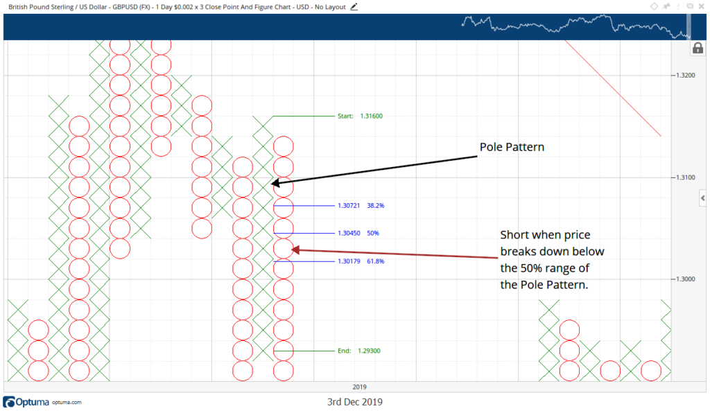
On Gold’s chart above, the column of Xs is as a Pole Pattern. Now, I didn’t know that this was a Pole Pattern until the first reversal column of Os printed. When the Os did print, I could identify the previous X column as a Pole Pattern.
Trading reversals with a Pole Pattern is simple: when price moves beyond 50% of the price range of the Pole Pattern, that is where you enter long or short. Drawing a Fibonacci retracement of the entire range of the Pole Pattern gave me the 50% level I needed. When an O closes below that 50% mark, that is my entry to short.
Japanese Candlestick Reversal Strategies
For those of you who are new to Point and Figure or who want a more contemporary way of trading reversals, this strategy will no doubt be of some use. Whether you are familiar with the Ichimoku Kinko Hyo system or not, you should be able to grasp this strategy reasonably quickly. The Kijun-Sen (Base Line) is often referred to as a dynamic 50% Fibonacci retracement level because it represents the current market equilibrium.
When I teach the Ichimoku Kinko Hyo system, I tell folks to think of price attached to the Kijun-Sen by a rubber-band. The further that price moves away from the Kijun-Sen, the more likely price is to snap back to the Kijun-Sen. If you measure the past seventeen extreme price moves away from the Kijun-Sen, add them together then divide by seventeen, you get an approximate max mean that price can move away from Kijun-Sen.

The chart above is a 4-hour Ichimoku chart of the NQ. The top of the current range we are looking at was right on a level that was considered to be within that max mean. If I see any instrument on any time frame exhibiting this kind of behavior (price a substantial distance from the Kijun-Sen), I immediately look at my two oscillators: the RSI and the Composite Index.
Observe how effective the Composite Index at detecting a divergence that the RSI could not. The RSI and price both have created higher highs, while the Composite Index created lower highs – a condition known as bearish divergence. When this occurs, I then wait for the Composite Index line to cross below either the fast or slow average – that is my trigger to enter a short. The profit target was Senkou Span B (Span B).

Another and more simple way to trade reversals is a simple confirmation check when price is near an area of support or resistance. The oil chart above shows horizontal lines represented as historical areas of support and resistance.
The highlight areas on the candlesticks, RSI and Composite Index, show a simple but effective reversal strategy: When price is at or near an area of support or resistance, check the RSI and Composite Index. If the RSI and Composite Index have mirrored structure (meaning, near identical peaks or troughs), then an opportunity to trade a reversal may be present.
Final Thoughts
Nearly all of the most sought after trading strategies deal with identifying reversals – and that is because being able to identify major turns in the market accurately gives you a significant advantage over the rest of the market participants.
While I am personally an advocate of the Point and Figure method, it is by no means the best or appropriate for everyone. Japanese candlestick charts provide much more specific entry points and can garner entries that are much earlier than would be found on a Point and Figure chart.
It is up to you to determine which style and method are most appropriate – and most profitable.