

For day trading a market with fixed supplies like the stock market, there are few tools as useful and as powerful as the tools found in Volume-At-Price Analysis (VAP).
VAP analysis differs from ‘normal’ volume analysis because VAP analysis displays how much of something was traded at a certain price, versus during a particular time.
The two primary forms of VAP are Volume Profile and Market Profile (Time Price Opportunity). Out of the two VAP options, Volume Profile is perhaps the most well-known and accessible.
Volume Profile vs Market Profile
Market Profile is different than Volume Profile, although many places and people will use the terms interchangeably. Market Profile is a more precise and definitely more distinct form of VAP analysis, as you will see.
I do want to point out that while TPO has some distinct advantages over the Volume Profile, that is not to suggest that the Volume Profile is somehow irrelevant.
Instead, I want to draw your attention to how complementary TPO is to Volume Profile versus utilizing Volume Profile solely. I also want to point out that TPO may not be appropriate for all traders and all time frames.
Some traders may find it extremely beneficial during short term day trading time frames but not as useful during long term swing trades that develop over periods of weeks or months. The software used for this article is MotiveWave.
Volume Profile
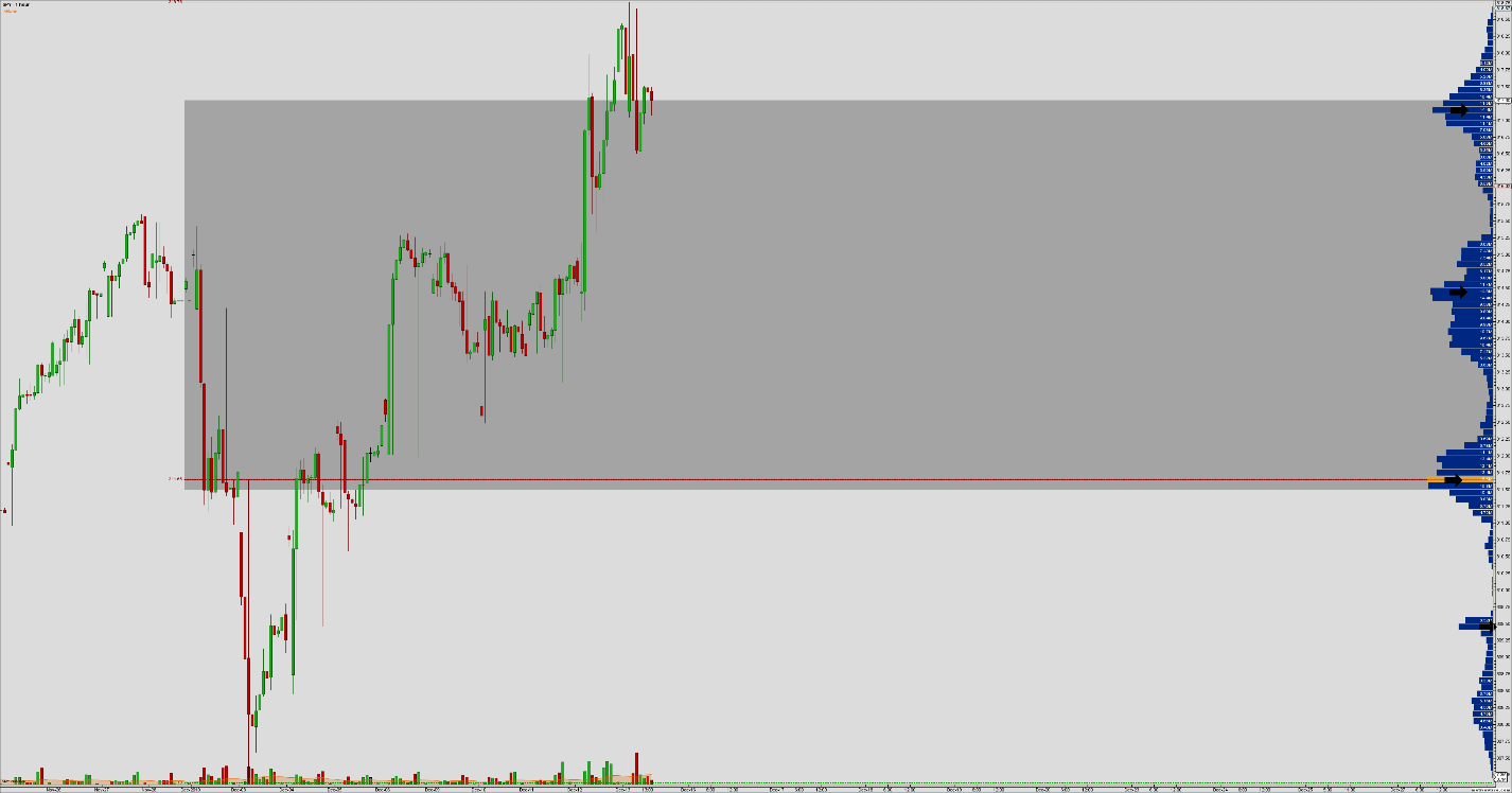
Volume Profile is a powerful and useful tool for determining important price levels. The chart above shows a Volume Profile of the SPY from the beginning of December 2019 to the current date (December 13th, 2019).
The black arrows point to areas where the horizontal bars are the longest; these are known as high volume nodes. The yellow bar with the red horizontal line is the Volume Point Of Control (VPOC).
The VPOC is the price level, where the most amount of volume has been traded. But the other high volume nodes are also important. A common strategy used by day traders is to identify where these high volume nodes are and then wait for price to break above or below those nodes.
The spaces in between the high volume nodes are important. Areas between high volume nodes that have little volume act as a sort of vacuum and ‘suck’ price through those value areas. It is not uncommon to see large candlesticks develop when price breaks above or below a high volume node.
While the Volume Profile itself is very useful, it is limited. That is where Time Price Opportunity (Market Profile) comes in.
Time Price Opportunity

The chart above shows an example of Time Price Opportunity (TPO). The starkest difference between the Volume Profile and TPO is not just the aesthetics; it’s the detail TPO provides. Nevertheless, it is important to understand the components to interpret them.
TPO answers two questions: What is the price action, and what are the most important prices? Candlesticks alone and do not tell us what price levels were important during the construction of that candle or the time period it represents.
Volume Profile does not inform us when particular price levels formed or during what sessions should be observed as important for the development of time-based support and resistance. Volume Profile is limited to measuring volume at particular price levels – TPO tells us how long price spent at a particular price level.
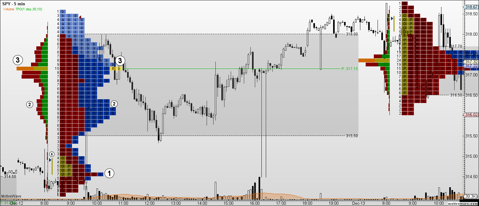
The chart above shows a series of daily TPO levels on the 5-min SPY chart. You can see the Volume Profile present on each TPO with it oriented to the left of the TPO and generating the Volume Profile’s columns to the left. The remainder of the TPO, though, requires explanation.
Timeframe – One of the best ways to determine price levels that are of importance is to delineate intraday timeframes. The chart above shows three different time frames represented by shading the cells a different color – yellow (1700 – 0800 EST), red (0800 – 1300 EST), and blue (1300 – 1700 EST). You may also notice that the colors appear to move from darker to lighter. Darker shaded cells represent price traded near the opening of the time frame, while the lighter shaded cells represent price trading near the end of the latter part of the time frame.
Cells – While the color of the cells represents a division of time during the day (as described above), the cells themselves also represent a unit of time. On this chart, each cell represents 30 minutes. The measure of how long price spent at a particular price level can be measured either graphically or numerically by looking a the numbers counting the total cells in each row. The shaded grey area represents where 70% of the trading has occurred in both price and time.
Attached Volume Profile – To the left of the TPO cells is the Volume Profile itself. This is useful because we can see how much volume was traded at a particular price level. While the Volume Profile and the TPO may look identical, the variable of time can show a divergence between the amount of volume traded at a particular price level and the time it has spent at that same level. Observe the VPOC at #3 and the POC on the TPO – they’re at the same levels.
However, if you look at the #2 on the TPO, you’ll see that it is of nearly equal value to the TPO POC of #3. But if we look at the lower #2 and it’s corresponding Volume Profile, we see a divergence in time and price compared to #3.
Initial Balance Range (IBR) – There is a significant number of Futures, Options, and Equity market traders that focus on the ‘pit’ open of their selected market(s). Others choose to focus on the action that occurs after. #4 identifies the Initial Balance Range or IBR.
There are many trading systems and theories that focus on percentage moves away from the IBR, the most common being 150%, 200%, and 300% of the range above and below. These values create important short term support and resistance levels. When those levels coincide with current or past TPO levels, especially in the same session-level, we get powerful support and resistance levels.
Uses for Day Trading
There are significant benefits and advantages to utilizing the TPO tool for day trading. This is especially true when you are trading during different trade sessions and time frames.
Being able to identify not just how much volume was traded at a certain price level but how long price spent at that level can be a powerful factor in determining a trade. I want to call your attention to the TPO image in the prior section, specifically to #1.
The SPY spent around 6.5 hours in one price zone but early zero volume was traded – this created a divergence in time and price. In order for a value area to be considered strong, we need to see an equilibrium of volume and time.
When that equilibrium does not exist, we can expect those price levels to experience weakness and allow large moves to generate when price breaks those value areas.
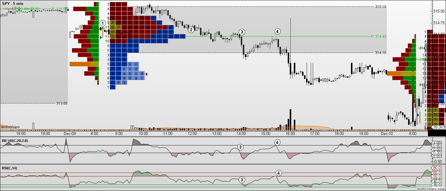
The above chart is another 5-min chart of the SPY. $1 identifies the 60-min IBR, with the opening of the range moving above the open. The POC on the TPO is 6.5 hours long. You’ll observe that while the TPO has formed its POC at this level, the Volume Profile’s POC is above near the top of the daily range.
When price breaks below the established TPO POC at #3, look below at the %B and RSI. The %B values have been adjusted to the suggested ranges in John Bollinger’s book, Bollinger on Bollinger Bands, to 0.8 and 0.2 vs. the base 1 and 0. For the example setup above, a breakout below the POC needs to be analyzed to determine if the breakout will continue south, or if it is a fake breakout.
The %B and RSI help with filtering this condition. There were indications of a short term bounce after the breakout was identified with the extreme troughs in the %B and the RSI. Pullbacks are an extremely common event on any breakout, with many traders waiting for a retest of the breakout to confirm an entry.
When price does retrace back up to the POC at #4, we can again look at the conditions in the %B and RSI. The %B shows rejection higher by stopping just below the 0.8 level.
Additionally, the RSI has found resistance against the 55 level, confirming the shift to a bear market biased RSI. From that point, we can see a strong and sustained move south.
If we were to utilize the Volume Profile alone, we would have missed an opportunity to capitalize on the strength of the move south. Further, the Volume Profile did not identify the importance of the variable of time.
Clearly, the importance of the development of how much time price spent to develop the TOP VOC was an important factor in the breakdown below the TPO’s POC.