

Momentum trading is one of our favorite styles of day trading so we put together a list of some of the best momentum indicators for day trading.
What is Momentum Trading?
Traders and investors define momentum slightly differently. If you ask an institutional investor who employs “smart beta” strategies, they might tell you that momentum consists of the best-performing stocks over a period like six or twelve months, rebalancing on a fixed basis.
If you ask a trader what momentum trading is, they might have a different answer.
Still, instead of focusing on absolute returns, momentum traders emphasize their preference for market strength relative to the security’s past strength.
In the trading world, momentum basically refers to the level of aggressiveness in the market. When a stock is showing strong positive momentum, buyers are jumping over each other to buy.
Consider the difference between Virgin Galactic (SPCE) and Apple (AAPL) in the following chart:

While Apple is slowly grinding upward in price, rising over 5% in less than three weeks of trading, SPCE was making new highs on an almost hourly basis, with huge rallies and shallow pullbacks.
The buyers in SPCE during this period were willing to pay just about any price for the stock to be a part of the action. Put simply, SPCE’s rate of change was faster.
Top Momentum Indicator: Rate of Change
Rate of change is a mathematics concept: it’s a calculation that displays how one value changes compared to another. The rate of change technical indicator does just that: it compares price changes to each other.
For example, the current reading of a 5-period rate of change compares the most recent price change in the time-series to the previous four periods.
The higher the current reading, the stronger the current momentum is.
Here’s how the rate of change indicator is calculated, according to StockCharts:
ROC = [(Close – Close n periods ago) / (Close n periods ago)] * 100
So with that mathy stuff out of the way, the rate of change tells us how fast the price is changing relative to your lookback period (the lookback period on a 5-period ROC is 5). A more extreme rate of change reading indicates a strong trend.

In this chart of NVDA, you can see that at the highest reading is the trend climax, that’s when the stock was showing the most substantial level of momentum. Price had just broken out to all-time highs, making strong bullish moves two days in a row.
Because markets, and stocks especially, don’t move in a straight line, the market began to pullback, crashing days later due to the entire market collapsing.
What’s interesting is that unlike most traders, who favor a longer-term ROC lookback period like a 14-period rate of change, she uses a 2-period rate of change.
A 2-period rate of change kind-of resembles an ECG heart monitor, with whipsaws every day. Here’s an example of GOOGL’s 2-day rate of change over a random few weeks of trading, compared to a 12-day rate of change for the same timeframe.
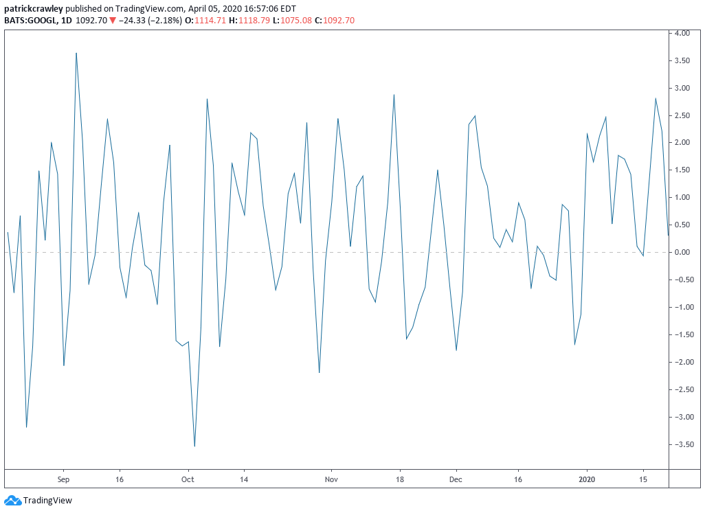

Let’s consider why it looks this way by first examining why the 12-day rate of change looks tamer than the 2-period ROC. With a 12-day lookback period, the indicator is averaging the price change of the previous 12 days, so for one day to make a significant change in that indicator, it has to be a significant enough move to change a 12-day average meaningfully.
We all know that the 200-day moving average of a stock doesn’t change much in one day, even if stock jumped 20% that day. This is because there are 199 other prices that it’s compared against.
Conversely, a 2-day moving average, will very closely track a stock’s price because it’s only looking at the previous two days. The same is true for a 2-period rate of change.
Instead of using the 2-period rate of change to look for big breakout trends, she instead uses it to trade the “three-day cycle,” in the style of swing trader George Douglas Taylor.
When the market isn’t in a strong directional trend, she will two-day moves. In other words, if the market goes up two days in a row without showing significant momentum, she will go short.
Top Momentum Indicator: RSI
RSI was created in the late 1970s by technical analyst Welles Wilder. He published his calculation for the oscillator in his book New Concepts in Technical Trading Systems. Back in his day, he couldn’t just load up TradingView or ThinkOrSwim and punch in a ticker.
He got books of charts mailed to him weekly and had to calculate indicators using an actual Texas Instruments calculator!
The interesting thing about RSI is that it is considered to be a momentum indicator because, like the rate of change, it compares the current price change to recent price changes–the higher the reading, the faster the price is changing.
However, almost everyone, including Wilder, uses RSI as a mean reversion indicator. That is, instead of using the RSI to identify market strength, they use it to identify overbought and oversold levels.
Here’s what your typical RSI indicator looks like: it uses a 14-period lookback. On the below chart, that’s 14 days because it’s a daily chart.

When it comes to RSI, the conventional wisdom is that readings above 70 are overbought, and readings below 30 are oversold. This is the advice that Wilders gave in his original book, and in general, the trading community still abides by it.
However, anyone who has done any extensive testing of different RSI lookback periods and levels knows that, historically, RSIs with shorter lookback periods perform much better than their longer-lookback period counterparts.
More specifically, data shows that RSI lookback periods below 6 have shown much better returns, for example, a 4-period RSI with readings above 80 considered overbought and readings below 20 considered oversold.
Larry Connors and his team at Connors Research are largely responsible for bringing to light these findings in the late 1990s and early 2000s, and they still backtest well.
Let’s take a simple backtest of how buying SPY when the 2-period RSI was below 20 on the daily chart.
Entry Criteria:
- 2-day RSI of SPY < 20
- Current price of SPY > 100-day simple moving average
Exit Criteria:
- 2-day RSI of SPY > 65
Here are the results:

These results can look deceiving because a simple buy-and-hold of SPY outperformed the strategy. However, we have to look at some key metrics here. “Beta” measures your portfolio’s level of exposure to the market–a beta of 1.0 means that your exposure is the same to that of SPY.
This means that if your portfolio has a beta of 1, your portfolio will go up about 1% when SPY goes up 1% and vice versa.
In the case of strategy, we spend lots of time out of the market and in cash, only trading SPY when the market conditions line up with our criteria. Because of this, our portfolio had a beta of 0.18 during the backtest period of 2009 to March 30th, 2020.
If we were to adjust our portfolio to have a beta of 1, our portfolio would have outperformed buy-and-hold by 2%, as evidenced by the measure of alpha, which is the excess return above beta returns.
Top Momentum Indicator: MACD (Moving Average Convergence-Divergence)
The moving average convergence-divergence is another classical momentum indicator for day trading. WIth MACD created in the 1970s, you might notice a trend here: 40-50 years later, we’re still using these old-school indicators with relatively simple calculations.
Is that because the world of technical analysis hasn’t advanced in the last few decades, or is it that these basic tools have proved useful? I’d say both because there have been hundreds of excellent tools created for active traders over the years that have been largely ignored.
Your typical MACD will have three components:
- The MACD Line: this is the slow moving average subtracted from the fast moving average. In the case of default settings, the calculation would be a 12-period EMA – 26-period EMA.
- The Signal Lane: This is the “slow-line,” it’s just a moving average of the MACD line. With default settings, this is a 9-period EMA of the MACD line.
- The Histogram: The histogram subtracts the Signal Line from the MACD Line. Because the histogram is displaying info that is already visible in the indicator on its own, many opt not to use this plot.
- When the histogram crosses above the zero-line, that means that the MACD line has crossed above the signal line, and vice versa.
So what does a MACD indicator tell us? Well, it’s kind of in the name: Moving Average Convergence Divergence–the indicator tells us when the two moving averages’ directions are converging on each other, going in the same direction, and when they’re diverging–telling different stories.
One popular use for the MACD indicator is paying attention to its short term swing highs and lows. This allows us to compare the relative momentum of price swings to each other.
Take a look at the following daily chart of Zillow:

Just by paying attention to the peaks and troughs in the MACD/signal lines in the macro sense, we get a sense of how strong the momentum behind some rallies are.
Their view is that, during a strong trend, price highs should be accompanied by new momentum highs and vice versa. In turn, when a new price high is unaccompanied by a new momentum high on the MACD, that’s considered a divergence.
The profitability of making a trend continuation (or pullback) trade in the presence of a momentum divergence is much lower than a trend continuation trade where the most recent price upswing also made a high on the MACD.
Consider the following rally in Wells Fargo (WFC):

During the initial upthrust of the rally, WFC made a significant new MACD high, with the following leaving the MACD declining. The subsequent new price highs showed pretty weak conviction, with the downside pullbacks showing a similar aggression level to the rallies.
This created a momentum divergence on the MACD, making a pullback or trend continuation trade a low-expectancy play.
Bottom Line
At the core, all trading strategies, regardless of their time frame, generally fall into two categories: trend following or mean reversion. Momentum strategies fall firmly in the trend following camp.
Trend following strategies all suffer from similar drawbacks: low success rate (lots of “fakeouts”), perennially late to the party (you have to wait for momentum to show up, meaning by definition you’ve missed some of the move), and the strategy goes through periods of sustained underperformance.
While a nimble trader can reduce these shortcomings through smart trading, a momentum strategy will always suffer from these issues on some level. A trader must learn about both mean reversion and trend following styles before specializing in one, as each style suits different personality types.