

Market internals are indexes that serve to provide additional context beyond price about how the broad stock market is performing.
or example, the most popular market internal is the Advance-Decline Index, which is a measure of the net number of stocks that went up today (number of advancing stocks – number of declining stocks = Advance/Decline).
You can think of market internals like giving the market a check-up at the doctor.
You’re pretty aware of how your health is doing without going to the doctor–your heart isn’t racing, your breathing is normal, you have energy, etc. But having a doctor take your heart rate, blood pressure, analyze your heart rate, and so on, can shine a light on any blind spots you might have.
Because sometimes, you can feel fine but when your doctor examines you, he finds out that you’re developing an arduous disease.
The same is true with the stock market.
If the S&P 500 is up 1% on the day, it’s a pretty good day. But for who? Did every stock in the index go up? Probably not. Did the majority go up? Maybe. We need some quantitative measure to really know the pulse of the market. Often times, the index will be an accurate barometer of how the average stock is doing,
And this is where market internals come in. They’re the heart rate monitor and blood pressure monitor of the stock market. They can tell you if more stocks went up today than went down, or how afraid investors are of a crash.
Many of these market internals aim to quantify market ‘breadth.’ In this case, breadth refers to how widely shared a market move is. As discussed, sometimes just a few mega-cap stocks like Apple and Microsoft can bring the entire S&P 500 up while the rest of the stocks are mostly declining for the day.
This is known as weak breadth and is indicative of a structurally weak market. Because as soon as the market leaders crack, there’s nothing left to hold up the foundation.
NYSE $TICK Index
This index is a second-to-second net-reading of upticking stocks vs. downticking stocks.
Essentially, if the $TICK is at +851, that tells you “in this second, 851 more stocks ticked up than ticked down.” The value of the $TICK is the difference between the number of upticking vs downticking stocks.
Because $TICK readings are only valuable for such a short period (being second-to-second readings), it’s mostly a tool favored by day traders over swing or position traders. Traders also tend to use short-term charts like 1-minute or 5-minute charts when analyzing the $TICK.
Below is the standard format traders will use to analyze a $TICK chart. A zero line, and lines at +- 800 and +- 1000.

As you can see by the randomness present on the $TICK chart, it’s more important to pay attention to how the market reacts to extreme values in the $TICK, rather than trying to perform technical analysis and find patterns in the $TICK chart.
The outer lines at 800 and 1000 represent points of extreme sentiment. Just consider what a -1000 reading means: that 1000 more stocks are going down than going up. There are less than 3,000 stocks that trade on the NYSE, so that’s a very extreme reading.
What does this tell us? At the very least, we can make the probabilistic assumption that the vast majority of stocks probably won’t continue to go up in lockstep. Markets hardly move like this. If we extrapolate that idea, we might consider fading that extreme sentiment by taking a counter-trend position in the S&P 500.
Ways to Use the $TICK
Persistence of Trend
Another useful tool that can give you an idea of the persistence of an intraday trend is a simple moving average.

A trend may begin to show weakness on the $TICK in the form of the moving average declining below the zero-line, before it shows up in the price of the S&P 500. This is just one way to view and use the $TICK.
Timing Pullbacks
Because stocks, and indexes especially, are so much choppier than bonds and commodities, it tends to make more sense to apply a swing trading approach (even if intraday swing trading) than it does the trend follower approach (wait for signal, try to hold as long as possible).
And by far the most popular trading pattern that takes advantage of the choppiness of the stock market is the trend pullback.

The objective of the pullback is to enter a strong trend while it’s experiencing modest short-term weakness. It’s easier said than done and endless analysis has been done to get an extra edge in trading pullbacks.
When we’re trading the index or a stock highly correlated to the index, the $TICK can assist us in this.
The idea is to wait for a pullback in a trend to begin to occur, and only enter once the $TICK has exhausted itself to the downside.
Let me show you an example…
It’s March 2, 2022, the Russia/Ukraine madness is well underway and the US stock market is rallying at the New York open following a tough decline the previous day. The $TICK Is looking healthy, with the 20-period moving average remaining above the zero-line all morning.


At 10:27, the S&P rallies 20 points in just 3 minutes, with some follow-through price action. A few minutes later, the market is taking a bit of a “pause,” backing off some of the gains without much conviction. This looks like a decent opportunity for a quick intraday pullback trade. And here’s where the $TICK can assist.
As we can see, between 10:51 and 10:57, the $TICK tests its extreme lows of the day while only registering as a modest pullback in the index price action. This gives us a slightly more favorable entry point as we know that selling pressure is highest here and still has failed to break the pullback pattern, suggesting a good potential of trend continuation.

Let’s be clear, the fundamental principles of trend trading, market dynamics, and how pullbacks work drive probably about 80% of the performance of a pullback trade, with confirmation and assistance from market internals making up the other 20%. So they’re not a magic bullet, but never underestimate the ability to improve your trading by 20%, that can be the difference between break-even and significantly profitable.
The S&P 500 Volatility Index (VIX)
The VIX is by far the most well-known of the contemporary market internals and for good reason. Many call it the “fear index,” because when the VIX goes higher, it’s an indication that investors are buying lots of expensive insurance on their portfolio in the form of put options. In general, when the market goes down, the VIX goes up, and vice versa.
The VIX essentially calculates the market’s 30-day view of annualized volatility in the S&P 500. The calculation analyzes how expensive option prices are compared to their intrinsic value and spits out a number like 15. A reading of 15 tells us that, over the next 30 days, the S&P 500 options market expects volatility to be 15% annualized.
The creation of the VIX in the 1990s led banks and brokerage houses to create derivatives by which investors can directly speculate on the VIX, and as a consequence hundreds of securities use the VIX as a reference price. In other words, when there’s a big move in the VIX, a whole lot of money changes hands, beyond even just the stock and listed options market.
Those derivatives got so popular that many view volatility-linked securities as an entire asset class, with hundreds of billions of dollars at play.
The remarkable thing about the VIX is just how predictable it is. A long-term chart of the VIX doesn’t look like a stock chart at all (that’s because it’s an index, not a tradable security):
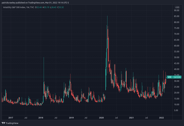
So while the VIX is predictable, you can’t trade it. There are derivatives, but because humans that also know how predictable the VIX is trade them, this predictability goes away. Let’s compare the above image of the VIX index, against a chart of VIX futures, which actually trade:

While the chart of VIX futures is far less predictable, it certainly still inhabits patterns. These are the cyclical patterns that volatility traders aim to take advantage of.
For the most part, traditional technical analysis isn’t that popular among VIX traders. Instead, most short the VIX on a big upwards spike, using a tool like Bollinger Bands, Keltner Channels, or linear regression to determine their rough entry points.
And I want to reiterate, the vast majority of VIX traders, especially the more active ones, focus on shorting VIX rather than buying it. There’s a subset of long-volatility traders who buy the VIX and other “crash-friendly” assets but they serve as more of a portfolio insurance service for high net worth investors than an independent trading strategy.
The most rudimentary (yet common and useful) way that traders short the VIX is by using a simple trading bands strategy. Take the chart below and assume you’re going to get short when the VIX touches the top band. Pretty simple, yet tons of traders make money using their own modified and tailored version of this type of trade.

Advance/Decline Line
The advance/decline line is a very simple yet genius market internal indicator. It essentially is a count of how many stocks advanced that day minus how many stocks declined that day. The result is a positive or negative number.
You can think of this tool as being like the $TICK index, except for overnight trading and not day trading.
Here’s an example of the Advance/Decline Line overlaid on a chart of SPY:
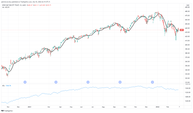
We can make some pretty useful conclusions from this. Firstly, breadth flattened out way back in June 2021, but we didn’t feel the effects of that until December 2021 when the market failed to break to new highs and ultimately fell into a downtrend pattern.
Even more interesting, is that despite the highly bearish sentiment and price action in the S&P 500 at the time of writing amid the Russia/Ukraine war, breadth has hardly weakened. When we combine that with the fact that we just observed a blatant Wyckoff Spring at a crucial support level, we might see a significant rally in the coming weeks.
This type of analysis is known as convergence/divergence thinking. It’s simply asking the question: does this predictive factor agree with the price? If not, is there potential for a reversal?
It’s worth noting that there are two key advance/decline lines: the NYSE version, and the NASDAQ version. It’s generally better to use the NYSE line because larger companies are overrepresented in the NYSE, but you can even spot divergences between these two lines, which could hold some crucial information.
Bottom Line
Price is the only marker that pays in the stock market. When you’re learning about interesting indicators like market internals, it’s key to keep that in mind because no matter how rigorous your analysis is, your P&L is truly the only thing that matters. You can’t tip your waiter with a good research report.
But market breadth indicators are becoming increasingly useful this decade as the Big Tech stocks have come to dominate the major equity indexes, with the top 10 components of the S&P 500 index accounting for well over 20% of the index itself. With disproportionate weightings like this, it’s crucial to use tools like market internals to keep an eye on how the rest of the markets are doing.