

Almost all traders and investors use stock charts.
Whether it’s an intraday chart or multi-year chart, stock charts place today’s price in context. Within seconds, they give us information about the market’s sentiment towards a stock, the short-term and long-term trend, and supply and demand.
While everyone uses charts, not all uses are equal. A Warren Buffett-style value investor will only use a chart to gauge the market sentiment, aka, does the market like or dislike this stock?
Traders, on the other hand, use stock charts to make the majority of their trading decisions. They use charts to identify and take advantage of supply and demand imbalances as well as for timing trades.
Types of Stock Charts
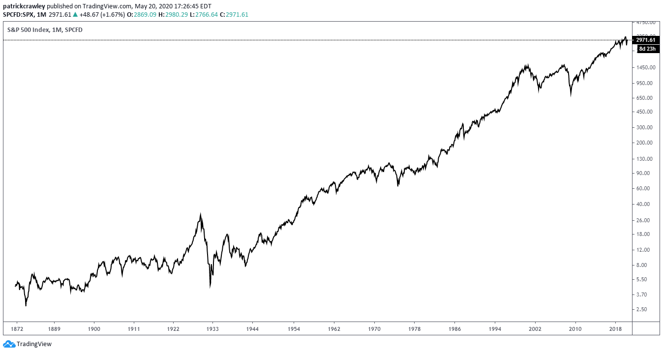
Not all stock charts are created equally. The most popular types are line charts and candlestick charts. Line charts are basic; they plot the price over time-series data, like in the example below.
Line Charts
The above chart gives us two data points: the date and the price. From these essential data points, we can make several insights about the trend strength and duration, how the stock price reacts to good/bad news and the stock’s average annual returns.
However, because each plot on the chart represents one day of trading activity, we have little data on individual trading days. We can’t answer questions like ‘how wide is the daily trading range?’ or ‘does this chart tend to close each trading day close to it’s daily high?’
Typical uses of the line chart:
- Investors needing a basic view of a stock’s trading history
- Removing noise from candlestick charts
This is where the more detailed candlestick charts come in. While line charts provide an easily digestible price history, they don’t offer the more in-depth information provided by candlestick charts.
Candlestick Charts
Candlestick charts are the paramount choice for active traders. Most candlestick charts are based on a daily time frame, meaning that each candlestick represents one day of trading activity. See the below chart.

Each ‘candle’ on the chart represents one day of trading activity. Each candle has four data points:
- Open: the first price the stock traded at when the market opened.
- High: the highest price the stock traded at during the trading day.
- Low: The lowest price the stock traded at during the trading day.
- Close: the last price the stock traded at during the trading day.
Note: the open, high, low, and close depend on the chart time frame. For example, a five-minute chart has a new ‘open’ or ‘high’ every five minutes, every time a new candlestick is created.
There are two different types of candlesticks:
- Bullish candlesticks: when the close price is above the open price. On most charting platforms, bullish candlesticks are green or white.
- Bearish candlesticks: when the close price is below the open price. On most charting platforms, bearish candlesticks are red or black.
Below is a helpful graph showing the differences between the two candlestick types. It’s straightforward.
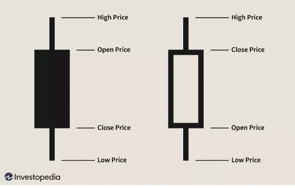
The rectangular portion of a candlestick is known as the “body,” while the thin lines are known as “wicks.” Analyzing the changes between these candlestick elements serves as the backbone of many traders.
This style can be called “price action trading,” with Steve Nison and Al Brooks being famous proponents.
Why Traders Need Charts
Day trading or swing trading isn’t about charts. It’s not the charts that make profitable traders; it’s risk management and the ability to forecast price trends and movements in stocks accurately.
With that said, charts are the most effective tool for carrying out these two essential skills.
All profitable trading strategies take advantage of predictable human psychology. Whether they know it or not, successful traders are full-time practitioners of behavioral finance.
Stock charts happen to be the most efficient way to plot the market’s irrational trading behavior in real-time.
And of course, without proper risk management, even the most skilled traders will go broke. Some traders, to their detriment, use static stop loss levels to manage their risk. This means they will use the same 1% stop loss on each day trade they take, instead of managing their risk dynamically, based on established price levels and volatility.
Elements of a Stock Chart
Volume
The cumulative measure of trading activity is volume. Volume is typically represented as a histogram on charting platforms, like in the chart below.

As you can see, there are labels on the volume y-axis. These refer to the number of shares traded in a given period; each bar represents a day of trading activity (daily chart).
You should view volume in conjunction with price. Allow me to demonstrate the importance of volume with a recent cultural example.
Here in America, early in the coronavirus panic, many people frantically stocked up on toilet paper. This lead to a shortage, which lead to price-gouging on private markets like Craigslist.
Imagine if you plotted the volume of toilet paper sales in the days leading to the peak panic. The chart might look like this:
It’s behavioral finance in action. The demand for toilet paper begins to increase, based on fear steadily. As other market participants realize, they also buy due to their fear of missing out, creating more fear.
Ultimately, this ends in a buying climax, which always leaves behind bag-holders. We’ve all read the stories about the folks who bought truckloads of toilet paper in the hopes of reselling it, only to be left unable to unload it.
Time Frames
Stock charts work on any time frame, from monthly charts to a 10-second chart.
Your time frame of choice should depend on three factors:
- The amount of risk you wish to take on each trade
- The number of trades you wish to make per hour/day/week
- Your schedule
Your risk level per trade will change with each timeframe. As you can imagine, the average range of a monthly candlestick is much wider than that of a 1-minute chart.
It wouldn’t make any sense to set a 10% price target when day trading Apple, in the same way, it wouldn’t make any sense to set a 1% stop loss when trading Apple on a monthly chart. You need to look at the volatility per candlestick on your time frame and set your risk parameters from there.
The prominent method of quantifying volatility on a given time frame is through the Average True Range. The ATR is essentially a reading of the average volatility per-candlestick.
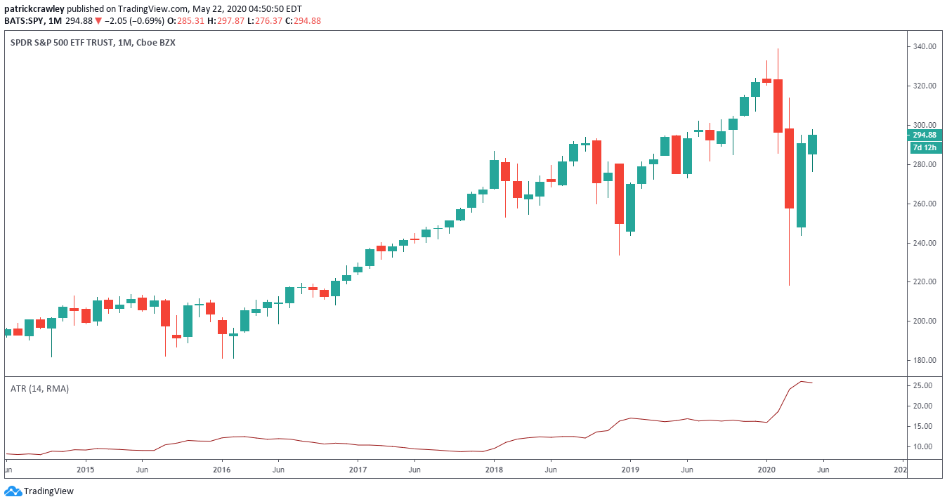
Here’s an example of the ATR on the SPY daily chart:

To demonstrate the difference, here’s the ATR on a SPY monthly chart:
Identifying Important Candlesticks
Some traders treat all candlesticks equally; that each candlestick tells us something about the market. These are the bar-by-bar guys like Al Brooks.
We tend to take a different view. You may have heard of the Pareto Principle: that 80% of effects come from 20% of the causes. 80% of trading profits come from 20% of your trades. 80% of the market share is owned by 20% of businesses, 80% of commerce occurs in 20% of a city, and so on.
This is how we view individual candlestick analysis.
While each candlestick tells a part of the story, individually analyzing each candlestick leads to analysis paralysis and confirmation bias. Instead, we look at the few essential candlesticks within each trade setup that tell 80% of the story.
Here’s few of those critical “Pareto Candlesticks”:
Doji

A doji is a candlestick with identical opening and closing prices. A doji is said to signify indecision on the part of the market. The Japanese say that “the market is tired.”
The meaning of a doji candlestick depends on the context of the trade setup. A doji near a new low in a sustained downtrend can indicate a change in sentiment. It’s not uncommon to see a gap up followed by an uptrend in these types of situations.
Here’s a chart example from WYNN stock in August 2016:

If we shift the circumstances so that a doji occurs amid a long period of sideways consolidation, the doji’s presence becomes less significant. By definition, sideways price action indicates the market’s indecision, so a doji doesn’t give us new information.
Here’s a chart example of Agilysys (AGYS):

In this sideways chart, there’s no definitive trend to the price movements. It’s just bouncing back and forth between $9 and $12, undecided on what to do next. As you can see by the arrows, there are several dojis in this period of several months, many more than a trending stock would have.
Hammer

The Hammer candlestick has a lower shadow that is typically twice the size of the candlestick body. The upper shadow is non-existent or small.
The Hammer candlestick is typically looked at as a reversal candle. In the common bullish scenario, the stock gaps down at the open amid a sustained downtrend. The bulls then take control throughout the day and the stock closes up on the day.
There’s some real market psychology at play here. The stock is already in a sustained downtrend; it’s value decaying each day. At a certain point, when the price gaps down, many bulls will perceive the price as ‘too low.’ They may be value investors, mean reversion traders, or bottom fishers.
When you see the hammer candle in this scenario, those bulls are thinking they’re getting a good deal; the market has gone too low, and now it’s time to reprice the stock. The hammer is a visual representation of this mass psychology.
The ultimate success of the bulls relies on the market’s agreement or disagreement that the stock is, in fact, ‘too cheap.’ If the market disagrees, the weak hands bought into the hammer candle will sell, resuming the downtrend.
Here’s a chart example in crude oil futures:
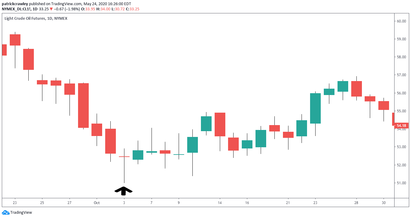
As you can see, oil prices we’re getting smashed until the hammer candle. While the price didn’t gap down in this example, we noticed that price moved significantly lower intraday, only to close near the top of the candlestick.
This Bullish Hammer didn’t result in an uptrend, but the bulls at least stopped the bleeding of the previous relentless downtrend.
Marubozu Candlestick
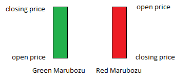
The Marubozu candlestick is characterized by little or no shadow, and all body.
The Marubozu candlestick is the most aggressive of all candlesticks. It indicates that one side–bulls or bears–were entirely in control of the price action from the open to the close.
The psychology at play with Marubozu candles is more straightforward than the previous two candlesticks we’ve analyzed. A Bullish Marubozu indicates that buyers are tripping over each other to buy the stock. There are no pullbacks because buyers are willing to pay higher prices to own the stock continuously. This goes vice versa for Bearish Marubozus.
Multiple Marubozus in a row indicates insanely high pressure on that side of the market. Extreme caution should be used when on the wrong side of these markets.
Here’s a chart example in an uptrend in Universal Corp (UVV):

As you can see, the uptrend was strong enough to take the stock from $54 to $77 in two months. Throughout the trend, you’ll find strings of Marubozu candles, indicating explosive demand for the stock.
A key thing to watch out for in any high-momentum trading setup is the pullback. If you look at the second red line in the UVV chart, that was the trend climax. All green candles with little to no lower shadows. The bulls were firmly in control and tripping over each other to buy shares.
The problem comes when that momentum wanes. As soon as buyers slow down, the insanely high prices become unsustainable. This allows steep pullbacks like those on the right end of the chart to occur.
As they say, there’s no free lunch. If you want to trade stocks with explosive momentum, steep pullbacks come with it.
Stock Chart Patterns
Just as the shape of individual candlesticks are visual representations of investor psychology, the patterns that several candlesticks form do so as well.
If you buy a book on Amazon, or Google search for some articles about chart patterns, chances are, you’re going to be confused.
For the novice trader, studying chart patterns can feel like grade-school all over again. You’re studying these arbitrary shapes that you’re supposed to memorize without any of the necessary contexts.
Patterns have weird names like Symmetrical Triangle or Fifth Wave Extensions. Authors often use unnecessary jargon like ‘subwaves,’ ‘amplitude,’ or ‘wedge,’ which make no sense to the uninitiated.
Plain and simple, chart patterns, like candlesticks, are a visual representation of investor psychology. Some patterns repeat themselves through history, whether you’re looking at the price of gold in the 15th century or a chart of the hottest new unicorn IPO.
Technology hasn’t changed investor psychology. The only difference is that there’s more noise in the data nowadays from automated trading.
Let’s take a look at a few profitable stock chart patterns.
Head and Shoulders Pattern

The head-and-shoulders is probably the most well-known chart pattern out there. It’s a reversal pattern, which means that this pattern is betting on the reversal or failure of a previously defined trend.
Let’s remove ourselves from the visual pattern and shape of the head-and-shoulders and try to understand what’s going on in human terms.
The head and shoulders is a trend failure pattern. This means that the previously defined trend, downtrend in the above example, fails when the H&S is successful.
Let’s bring our attention to Shoulder #1 and the Head. Cover the rest of the chart with your hand. At this point, the bears are still in control, and the downtrend is working out well.
It’s around Shoulder #2 where bears get in trouble. A higher-high is made (along the neckline). This is indicating that bulls are getting more aggressive and threatening the status of the downtrend. Then, a higher low is made in Shoulder #2, further weakening the downtrend.
The head & shoulders pattern is simply a visual representation of a trend reversing or failing. When price breaks through the neckline, the pattern is confirmed, and H&S traders have entered their positions.
A Note on Reversal Patterns
It should be noted that the term “reversal pattern” can be a bit misleading. When a trend ends, it doesn’t necessarily mean a new trend in the opposite direction immediately begins. It’s more likely for there to be a significant counter-trend move, then sideways consolidations for a while before a new trend begins.
Flag Patterns

The flag pattern got its name because the pattern’s price action resembles a flag on a flagpole.
Flags are trend pullback patterns. This means that you’re taking advantage of a momentary pause in the prevailing trend to hop aboard the trend.
Take a look at the above example. It’s an ideal bearish flag pattern. The steep red line is the ‘flagpole,’ and the green price channel is the ‘flag.’ When price breaks to the downside of the green price channel, traders short the stock and close the trade at the consolidation marked in black.
Let’s again remove ourselves from the jargon and visuals of the chart pattern and break down what’s really going on.
In the above example, at the very beginning of the chart, the stock is within a downtrend and has just made a sharp downward move. Because stocks hardly move in a straight line, the stock pulls back a bit and drifts higher (as marked in the green).
Note that the pullback’s price action is considerably less aggressive than the price action of the flagpole.
As for exit strategies, there are dozens of ways to skin a cat. One way that works well is to stop a stop loss above the flag, and wait to see what the market gives you if the trade works out well, exit when the momentum slows down.
A good flag setup will be harmonious with the longer-term trend. A Bearish Flag Pattern should be matched by a downtrend on the daily/weekly chart to maximize your probability of success.
Technical Indicators on Stock Charts

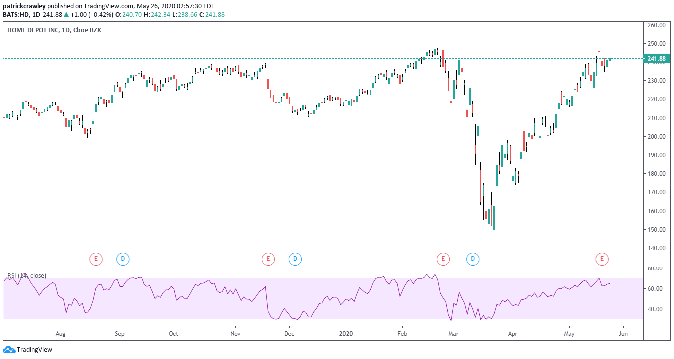
Example of a stock chart with two technical indicators, RSI and Bollinger Bands.
Technical indicators are like math equations you can automatically run on price and volume placed on your charts. These math equations are as simple as an average of prices over time, to much more involved math.
Some of these math equations can help you forecast price direction, identify if a stock is trading too high or low, compare the price movements of two different stocks, or simply help you organize the price action on the chart.
There are thousands of technical indicators out there. Some cost money, and most are free. If you use TradingView for your charts, you’ll notice that the platform provides hundreds of indicators, but there are hundreds of additional community-developed indicators.
With thousands of indicators to choose from and learn about, where do you even start? How does anyone pick the “best” indicator to use?
Luckily for you is that the world of technical indicators is mostly noise. All indicators aim to capitalize on two stock market phenomena: mean reversion and trend following.
Mean reversion indicators help you to identify when something is overbought or oversold. In other words, the price is ‘too high’ or ‘too low.’
Trend following indicators help you spot new trends and when the supply/demand balance is significantly shifting in one direction.
While the developer of an indicator will claim that they have some “proprietary methodology,” remember all indicators capitalize on these simple concepts. Differences between them are incremental and dependent on your ability to interpret and utilize them effectively.
So as long as the concepts behind the indicator are sound, it doesn’t matter which indicator you use, but how you use it.
For that reason, we’ll focus on a few of the most popular indicators and how to use them to your advantage.
RSI
RSI: the Relative Strength Index. The RSI indicator is a mean reversion focused indicator, meaning your primary use will be identifying overbought and oversold conditions.
The indicator is insanely simple to use when RSI is low, the stock is ‘oversold’ and is more likely to rally shortly. When RSI is high, the stock is ‘overbought’ and is more likely to drop soon.
The RSI is separate from your candlesticks and shows up on its own pane above or below your chart. This is because the RSI’s calculation is from 0 to 100, meaning it doesn’t have the same scaling as your candlestick chart.
Here’s an example:
How To Use the RSI
When using the RSI period, you have to select one input, the ‘lookback period,’ this is the number of candlesticks the indicator uses to calculate it’s value. In other words, a lookback period of 14 will use the previous 14 candlesticks to calculate the RSI.
A simple trick for selecting the lookback period is to base it on how many candlesticks you want to be in a trade. For example, if you trade using a daily chart and want to be in a trade for, on average, four days, you should use a lookback period of 4.
Basic RSI Mean Reversion Strategy
RSI is best used in conjunction with other chart reading techniques. If you blindly buy any stock with an overbought reading, you’ll continuously buy falling knives. Keep this in mind, and don’t throw out your chart reading skills in favor of relying on a math equation.
The most simple and effective method for trading with RSI is to combine trend following and mean reversion. Use trend following to select the stocks you’re going to trade: stocks in strong trends, and mean reversion to choose your entries: buying pullbacks in the direction of the trend.
Let’s use an example. Suppose we want to be in a trade for about three days and trade on a daily chart. We should use a 3-period RSI. For RSIs with shorter lookback periods, overbought and oversold levels will be 80 and 20, respectively. This is due to their tendency to whipsaw more on shorter lookback periods.
Our entry criteria will be when the RSI is below <=20, and our exit criteria are when RSI crosses above 65.
The green arrow is the buy point, and the red arrow is the sell point.
Here’s an example of how this looks:

MACD
MACD stands for Moving Average Convergence Divergence. That’s kind of a confusing name, but it’s mostly jargon. In actuality, the MACD is quite simple.
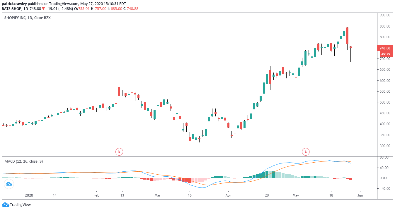
The MACD indicator has three components:
- Two exponential moving averages (defaults are typically 12 and 26)
- MACD line = shorter-term EMA – longer-term EMA
In the chart below, the two moving averages are represented by lines, while the MACD line is plotted as a histogram.
The MACD is a trend-following and momentum indicator, meaning it’s used to spot situations where supply and demand is significantly shifting in one direction over time.
Ways to Use the MACD Indicator
The MACD is a versatile momentum indicator. Unlike the RSI indicator, which is generally used for one purpose, each trader who uses the MACD applies it differently.
MACD Crossovers
A “crossover” trade is when the entry criteria for your trade is contingent on one line crossing over another. In the case of MACD, you can trade crossovers of the moving averages: go long when the short-term EMA crosses above the long-term EMA, and vice versa. Another option is to go long (or short) when the MACD line crosses above (or below) the zero line.
Higher Highs and Higher Lows
At its simplest, a stock trend is simply a series of higher highs and higher lows for uptrends, and lower lows/lower highs for downtrends.
You can apply the same simple trend analysis to the MACD indicator. The difference here is that you’d be looking at “momentum” highs and lows, as opposed to pure price levels.
Using momentum highs and lows has its advantages.
Convergence and Divergence
These two phrases are obviously in the name and are probably the most popular method of MACD analysis.
Let’s get two things straight first.
Convergence is when two things meet, like two rivers converging into one stream. In the context of the MACD indicator, there is convergence when price and MACD ‘agree.’ In other words, if a new high accompanies a new price high in the MACD, that’s convergence.
Traders use convergence as confirmation that their view is sound. For example, if you’re trading a chart pattern, you may check to see if the MACD converges with your price forecast. If it does, that puts the odds further in your favor.
Divergence is when two things move away from each other. An example is when someone’s political opinions go from one party to another. You can say that their opinion has diverged from their political party’s opinion.
In the MACD context, divergence is when you see something on a price chart that looks bullish, but the MACD is telling you that things are looking bearish. Traders use divergence as a signal to avoid a trade opportunity, or as a signal that a trend’s momentum is declining.
Take an example in one of today’s hot stocks: Zoom Video Communications (ZOOM).

As you can see, ZOOM’s in a steady uptrend. The price is making higher highs and lower lows, and the 20-day moving average is trending upwards.
However, the MACD peaked in late March, making lower highs since then. This is a textbook example of MACD divergence. The trend’s momentum is weakening, and divergence traders are probably avoiding getting long this stock.