

Updated January 11, 2025 – Written by Ross Cameron
Candlestick charts are now the de facto charting style on most trading platforms so knowing how to read candlestick charts is of utmost importance.
What is a Candlestick Chart?
Candlestick charting is simply a method of displaying price information in a market. Unlike a simple line chart, each series on a candlestick chart contains four data points:
- The opening price
- The high price
- The low price
- The closing price
Here’s an example of what candlesticks look like:

As you can see, there’s a red candlestick, and a green one, and they both represent different things. When a candlestick is red (this color may vary by platform and can be changed), it means that the closing price was less than the opening price.
Conversely, when the candle is green, that means that the closing price was higher than the opening price.
Anatomy of a Candlestick
A candlestick has three basic features:
- The body, which indicates the open-to-close range
- The wicks (also called tails or shadows), which are the long thin lines above and below the main body. These reveal the intra-day high and low.
- The color, which represents the direction of price movement. A green (or white) body shows a price increase, while a red (or black) body indicates a price decrease.
Body
The main body (colored portion of the candlestick) shows you the opening price and closing price of the stock.
A long body indicates heavy trading and strong selling or buying pressure, while a small body indicates lighter trading in one direction and little selling or buying activity.
Color
Green or white candlesticks signify the stock price closed higher than it opened.
A red or black candle tells you the stock price closed lower than it opened.
Wicks
The highest point of the upper wick shows you the highest traded price for that time period. If the open or close was the highest price, then there will be no upper wick.
The lowest point of the lower wick indicates the lowest traded price for that time period. If the open or close was the lowest price, then there will be no lower wick.
Open, High, Low and Close
Each marking on a candlestick (as displayed in the above image) represents either the opening price, the closing price, the high price, or the low price. On their own, those words make a lot of sense: you can figure out what the “high price” means, but their meanings can get a bit confusing when it comes to candlestick charting.
What comes into your head when I say the phrase “closing price?” I bet you think of the stock market close at 4PM. And you’re right, that is the close of the day. On a daily candlestick chart, in which each candle represents one trading day of price action, the candlestick close is equal to the last price traded on the day.

But, what if we switch to a 5-minute chart, where a new candle is created every 5 minutes? Sure, the market still closes each day at 4PM, but on a given day, there are 78 five-minute candlesticks.
Here’s a 5-minute chart for the entire day’s price action:

There’s roughly 78 candlesticks in that chart, and each candlestick has it’s own unique Open, High, Low, and Close. So every five minutes, there’s a new “five minute high,” or “five minute close.”
These values are arbitrary, and don’t have inherent meaning the way the actual open of the stock market at 9:30AM EST does. However, many traders use these arbitrary values to create trading strategies.
Now that you have a basic understanding of how to read a candlestick chart, let’s talk about how to read the price behavior, otherwise known as “price action.”
Examples of Popular Candlestick Patterns
- Bullish hammer pattern
The hammer candlestick pattern is formed of a short body with a long lower wick and is found at the bottom of a downward trend. This pattern is a strong indication that a reversal is about to occur. It tells you that sellers are giving up, and buyers are taking over.
- Bullish engulfing candlestick
The bullish engulfing pattern is formed of two candlesticks. The first candle is a short red body that is fully engulfed by a bigger green candle.
It is perhaps the most sought after bullish candlestick patterns as it is more confirming of a bullish move in the price of a stock. This pattern shows pure and unquestionable control by the buyers, and almost always results in higher trending prices.
- Bullish morning star candlestick
The morning star candlestick pattern forms at the bottom of a downtrend and is made up of three candles. The first candle is any long and bearish candle, the second one is a small and indecisive, and the third candle is any long and bullish candle.
This pattern indicates that the selling pressure is cooling, and a bull is on the horizon.
How to Read Candlestick Charts – Price Trends
Everybody knows what a trend is. It’s when something is consistently going in one direction for a period of time. The same stands true for the stock market: when a stock is consistently going in one direction (up or down) over a period of time, that’s a trend. Market trends can last seconds, minutes, hours, even decades.
Think about the most recent bull market in the US stock market. The market had gone up consistently for about 10 years before finally making a substantial pullback:

On the other hand, consider this intraday (intraday means inside one day) trend in Zillow stock (Z), which lasted just a few hours:

So how do identify trends in candlestick charts? It’s quite simple actually, and it’s similar to the method for identifying charts on other graphed data.
There’s three steps to identifying a trend on a candlestick chart and they’re quite simple:
- First, just glance at the chart quickly. Is the stock going up, down, or sideways?
- Second, we zoom-in a bit and analyze the intermediate-term peaks and troughs in the trend
- Lastly, we use steps one and two to make an educated guess about where we are in the trend currently: are we closer to a low or a high?
Highs and Lows, Peaks and Valleys
So now we have our gut feeling as to where the trend direction. Now we just need to perform some simple trend analysis so we can get a more detailed understanding of how the trend is playing out.
You probably understand the concept of peaks and valleys as it relates to mountains. Mountains have their very high peaks, which are usually followed by much lower points called valleys. Few, if any mountains follow a straight path upwards. The same is true for stocks. Even if the strongest trends will have momentary pullbacks.
The peaks and valleys in stocks trends are the most important aspect of trend analysis in my opinion. It’s high level information that tells the entire story. We can sum up our trend analysis with the following maxim:
An uptrend consists of higher highs and higher lows.
A downtrend consists of lower highs and lower lows.
In other words, a strong stock trend is characterized by not just high peaks, but each peak and valley being higher than the previous peak and valley.
The below chart is a great example of a strong uptrend. Sure, the stock still comes down sometimes and forms a valley (or a trough, same thing), but each successive peak and valley are higher than the last.

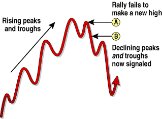
When a trend fails to make a higher high or higher low, it should be considered a weakened trend at the least, and a trend reversal at worst. These are not the ideal trend setups to trade.
Here’s an example, from Stocks & Commodities Magazine, which displays a weakened trend perfectly:
The Educated Guess
Now we need to form a hypothesis.
So, how do we form our hypothesis? You can make this as simple or complicated as you please, but I’m going to outline a simple example here, with some more complex ideas to follow.
We want to first measure whether the gap between peaks and valleys has been widening or tightening over time. We can achieve this by finding the peaks and valleys and drawing lines connecting them. Are the lines getting steeper or flatter?
Of course, what constitutes a peak or valley will vary from trader to trader. But this will give a rough idea of how long it takes for a peak-to-valley to occur, and how significant the resulting changes in price will be.
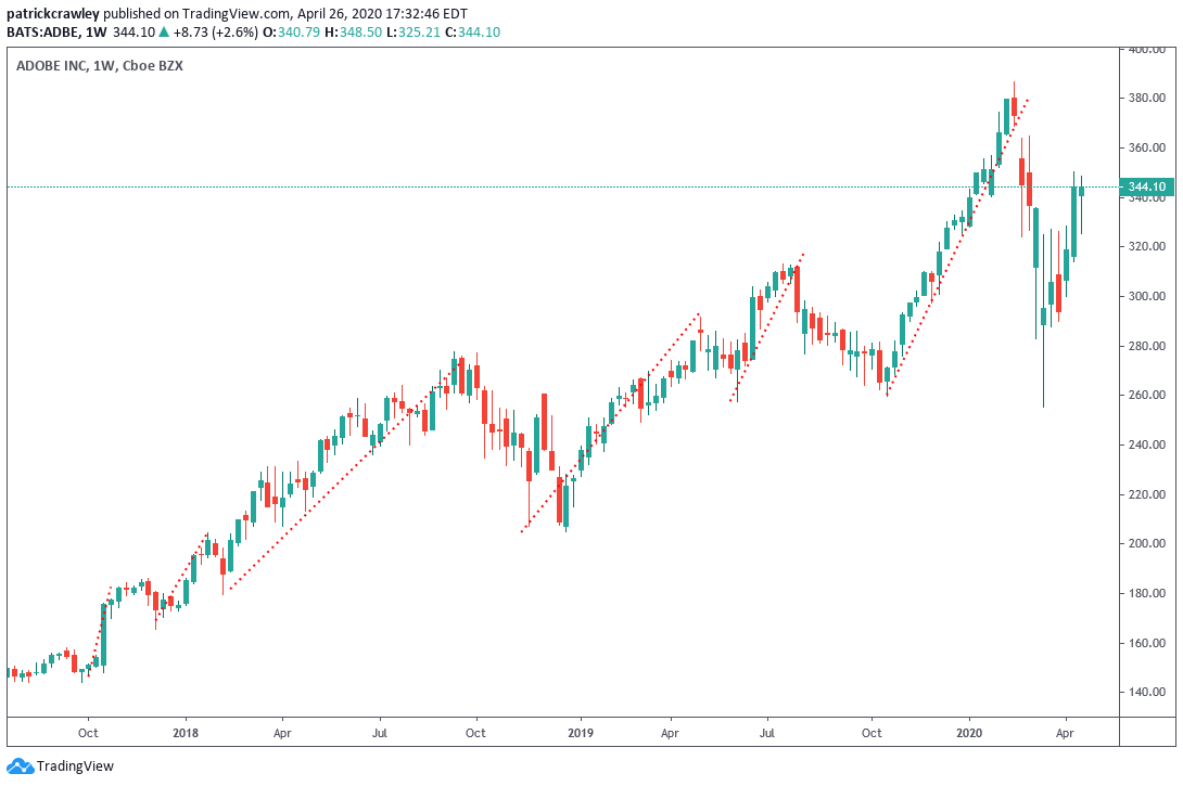
As you can see in our chart example of Adobe (ADBE) above, the stock momentarily broke it’s trend of higher lows. However, when this occurred, buyers got so aggressive in buying the stock at those levels, pushing it back up very quickly. This is indicative of outsized demand at these levels.
If we extrapolate a similar trajectory to the forming of the most recent peak, we can see that price is currently at about the midpoint. This is because we expect the coming peak to surpass that of the late 2019 peak in price, or else our hypothesis would be proven incorrect.
This represents the power of a candlestick chart, that long wick was able to tell us so much about the mindset of the market in just a second.
This is relatively superficial analysis, but hopefully you get the idea behind it. As you advance as a trader and study more, you’ll create your own ways to analyze trends
Bottom Line
Candlestick charts have become the standard choice for technical traders today for a good reason. They give you plenty of information without making it difficult to absorb.
Steve Nison, considered the “grandfather” of candlestick analysis, says that candlesticks key you into what traders and investors are thinking at any given time.
Candlestick analysis is a deep subject with plenty of thick books to absorb for those wanting to study more. This article was meant to give you a big-picture understanding of how to read a candlestick chart and how to apply some basic analysis on a candlestick chart.