

It’s very easy to get tunnel vision staring at a 1-minute intraday chart.
While you might have an excellent feel for where a stock might go for the next few ticks, you can quickly lose sight of the big picture.
The use of multiple time-frames in technical trading can really help traders understand the big picture and confirm price action, but it needs to be used correctly and in the right context.
Some traders in losing positions tend to use it to justify not exiting the trade. Perhaps they entered a trade on the 1-minute chart, looking to make a few cents per share.
But next thing you know, the position is against them, and they’re drawing lines on the weekly chart and reading SeekingAlpha articles, trying to justify holding onto their position until it shows a profit.
It should go without saying, that is not the way to utilize multiple time frame analysis.
So, how do you use multiple time frames with your swing trades?
Timing Entries and Exits
The most common way traders use multiple time frames is to have three-time-frames: the trading time frame on which they base their trading decisions and levels, the entry/exit time frame to reduce your transaction costs by executing at opportunistic zones, and your big picture time frame which gives you a sense of the drift of the market.
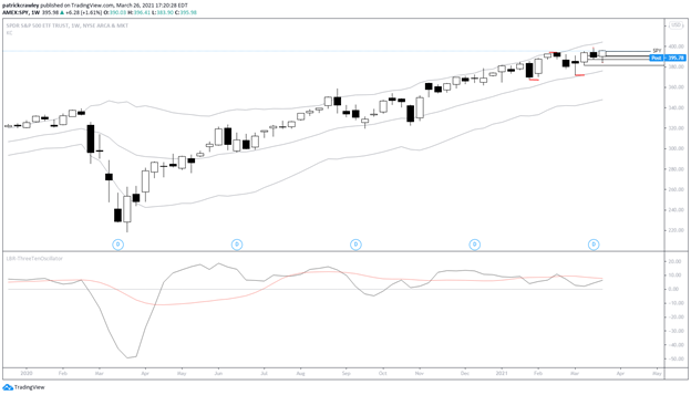
Let’s look at an example of this in the SPY ETF to keep things simple. We’ll use the daily chart as our trading time frame, the weekly chart as our big picture time frame, and the 15-minute chart as our entry/exit time frame.
First, let’s look at the daily chart. I’ve marked the recent highs and lows in red for reference.

This is the chart where we would search for trading ideas.
Off the bat, we notice that SPY is an uptrend, a weak one at that. The local highs and lows are not forming a nice stair step pattern, and there’s no sustained momentum until the most recent two days.
Recently, the market has tended to meltdown on the downside while drifting slowly upwards on bull moves.
This article isn’t meant to be a technical analysis of the SPY, so what you conclude from this is up to your trading style and time frame. Let’s move onto the weekly chart and see what the big picture might be telling us.
The story here is very much similar to that of the daily chart.
There’s an apparent upward drift to the market, but no momentum is present to make us excited about joining the trend.
You might also notice that the market isn’t at an extreme of either side of the price bands, meaning that if a potential daily chart entry presents itself, we don’t have to worry about the market being too overstretched or exhausted on the weekly.
At this point, we’re kind of in the middle of a noise area. We’re between the middle of a recent swing high and low and are uncertain about the trend’s health.
Let’s pretend that the presence of strong upside momentum over the past two days makes us bullish, and we want to join the trend.
Well, we’re kind of in no man’s land on the chart. It’s a bit too stretched to enter a pullback trade, but maybe there’s a potential breakout entry.
So for the sake of example, let’s say we have a target: a breakout to new highs.
The weekly chart is in an uptrend and doesn’t seem to be at an extreme, and the recent move away from the most recent swing low had some momentum behind it.
At this point, the analysis would end for many traders. They’d set a buy stop a few ticks above the most recent swing high and wait for the order to trigger. That is fine.
However, we could (1) potentially get a better execution by monitoring the intraday price action and (2) spot the emergence of a new pattern on the intraday chart. By definition, patterns show up on the lower time frames first.
So let’s take a look at the 15-minute chart of SPY and see if we can spot anything interesting.
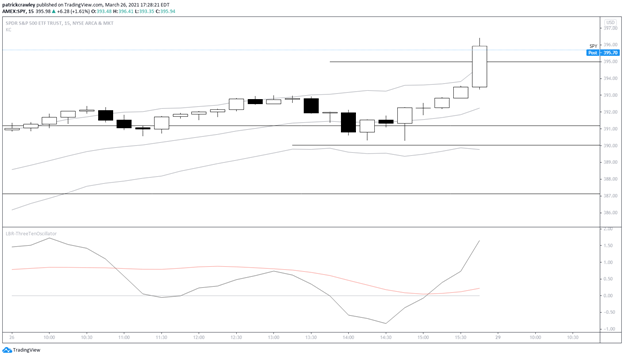
A very strong close.
There’s an old saying about bull and bear markets: in bear markets, stocks tend to open strong and close weak, and in bull markets, stocks tend to open weaker and close strong.
Not a hard and fast rule, nor have I quantified it, but it’s worth noting how bullish that price action around the close was. This chart is from a Friday, so there could be some funny business going on around weekly options expiration as well.
Confirmation
The best trades tend to occur when multiple time frames agree with each other.
In other words, when a long setup on a lower time-frame like the 15-minute chart occurs while the market is also at a favorable buy point on the daily chart, and while the weekly chart’s trend is also up and not overextended.
Sometimes that day trade on the 15-minute chart can be reduced in size near the close and turned into an overnight swing trade.
Convergence and Divergence
If you’re swing trading on the daily chart, it’s essential to know what the lower time frame looks like. As mentioned earlier, clues emerge that could confirm or deny your thesis.
Often, a pullback in an existing uptrend is a downtrend on a lower time frame. This can create a rabbit hole, where you say to yourself, “I’m a trend trader, I don’t buy downtrends,” but this is a problem of separating your trading time frame and your lower time frame.
If you trade the daily chart, don’t get cues about the trend from the 1-minute chart and vice versa.
However, you could get cues from an hourly chart as a daily chart trader as to when the lower time-frame downtrend is weakening. You might buy a new low on the intraday time frame, positioning yourself to get a good price for the daily time-frame.
Or, you might wait for the lower time frame trend to break so your trades start working in your favor quicker.
Let’s take an example. Here’s a pullback setup in American Outdoor Brands (AOUT) from February 2021:

Because this is a pretty small-cap stock, the stock trades pretty choppy at times. You can see a pretty sustained pullback starting around mid-February, which took several days to play itself out.
You could have bought at any point in the pullback and assumed that you were getting a good price, only to see the pullback continue against you for a few more days.
Many traders would advocate waiting for the lower time frame downtrend to break before entering, placing a buy stop above an intraday high.
This is, of course, a trade-off because you get a worse price, but because the momentum is moving in your favor, you might be able to justify having a slightly tighter stop.
Broad Market Direction
Have you ever seen a cluster of related stocks set up with nearly identical charts? Maybe it’s the chipmakers, gold miners, or homebuilders. If you watch the broader market, it can give you insight into what is driving the moves.
Before you start trying to watch every asset class, sector, and industry group, it helps most just to watch the equity indices: the S&P 500, the Nasdaq 100, and the Russell 2000.
The S&P 500 is basically just the largest US-listed companies, the Nasdaq is typically the more speculative market leaders, and the Russell is the small caps. The relationships between these can shortcut your process of finding trade ideas.
For example, for the second half of 2020, the Russell 2000 index of small caps lead. It paid to bias your trade ideas towards these names, not only because the market began to prefer them, but because much of the float was being eaten up by passive investors like ETFs and mutual funds as they grew.
Right now, the S&P 500 is leading, which means there’s a rotation from small-cap and growth towards mega-caps and names that skew more towards the “value” end of the spectrum.
It hardly pays to fight the wind.
Once you’ve made broad market analysis a part of your routine, you can start to look at other asset classes like commodities (gold, crude oil, etc.), bonds (US 10 Year Note), and a volatility index like the VIX.
Bottom Line
This is probably true across time frames. Without considering the context of the setup you’re taking, whether it’s the lower or higher time frame context, you’re missing crucial pieces of the puzzle.