

The recent sharp selloff in US markets might be indicative of a broader weakness developing in market breadth.
Due to the top index components being so heavily weighted in the indexes, their strength is presenting a potentially misleading picture of how the average stock is performing.
How Indexes Work: Why Index Calculation Can Distort Our View of the Broad Market
Before we move on to discuss market breadth, we should first establish how indexes like the S&P 500 work.
The S&P 500 is the de facto gauge of how US stocks are doing. Turn on the news and you’ll surely hear the caster say something like “markets are strong today as the S&P closed up 30 points.”
But to understand what that really means, we need to understand that indexes like the S&P 500 are simple calculations.
The S&P 500 index is unsurprisingly managed by Standard & Poor’s and is made up of roughly 500 US-based stocks that meet certain size and profitability criteria. But each stock in the S&P 500 isn’t treated equally.
The bigger the company, the larger the weighting the stock has in the index. Predictably, the largest stocks have the most influence on the index’s movements.
So let’s take a look at the top 10 components of the S&P 500:
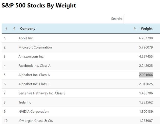
The top 10 are very tech dominated. The only non-tech stocks are JPMorgan (JPM) and Berkshire Hathaway (BRK.B), you could argue that Tesla (TSLA) isn’t tech, but the market treats TSLA like a tech stock from a valuation perspective.
These top components (excluding Berkshire Hathaway and JPMorgan) account for over 25% of the S&P 500, based on data from Finasko.
What is Market Breadth?
Market breadth is a method of analyzing the strength of the stock market holistically.
Rather than viewing market strength through a market cap-weighted index like the S&P 500, market breadth aims to determine strength through measures like the number of advancing stocks compared to declining stocks, or the amount of volume executed on upticks versus downticks.
Because market cap-weighted indexes like the S&P 500 are heavily influenced by their largest components (the top 10 components currently account for 28% of the entire index), it doesn’t paint an entirely accurate picture of how the average stock is performing.
This is especially true in an age of business dominance by tech giants like Amazon, Apple, and Google, which are putting legacy industries out of business everyday.
One of the most popular measures of market breadth is the Advance/Decline Ratio (ADR), which is a simple arithmetic formula, dividing the amount of stocks that went up on a given day, to the amount that declined on that day.
From ratios like these, traders and analysts can make conclusions from convergences and divergences between market indexes and the ratio, or “breadth.”
For example, if the S&P 500 is roaring upwards while the advance/decline ratio is declining, that indicates that a few very strong stocks are driving the rally, while the majority of stocks lag.
However, it’s rare that the ADR is actually declining while the market is ripping higher, instead, you’ll typically find divergences when the market makes a new high unaccompanied.
Here’s a few examples of market breadth indicators:
- NYSE Composite
- NYSE Advance/Decline Ratio
- NYSE Up Volume – Down Volume
- NYSE Cumulative Volume
- The S&P 500 Volatility Index (VIX)
- NYSE Cumulative Tick Index ($TICK)
And those are just equity index-level breadth indicators. You can look at credit spreads, equal-weight commodity indices, sentiment indexes, options indices that measure the number of buy-to-opens vs. sell-to-opens, etc.
For the sake of brevity, we’ll stick to the equity markets.
Here’s an example market breadth dashboard I have setup in Thinkorswim that might give you some inspiration:

Starting from top-left: NYSE $TICK, VIX, Up Volume – Down Volume, S&P 500 Futures, and the NYSE Advance Decline Ratio
Examining the Diverging Breadth
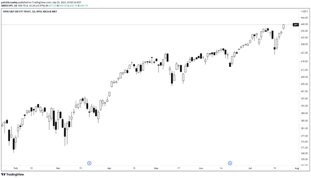
Despite the recent severe two-day drawdown experienced in the US markets, they’re still consistently making highs week after week.
The S&P quickly recovered from the plunge and just made a new high today (July 23). On a technical level, things are looking pretty strong with no compelling reason to be bearish on a technical level.
However, various market breadth indicators do not paint as rosy a picture.
Let’s take a look at the 10-day moving average of the Total Advance Decline Ratio, which takes into account symbols from the NYSE, Nasdaq, and AMEX.

As you can see, market breadth has been weakening since the 2020 market crash, making lower highs with each subsequent upward thrust.
We can paint a better picture when we overlay the movements of the ADR over the price action of SPY. Because my platform TradingView doesn’t do this well, this chart from the excellent Jeff Hirsch, author of The Stock Trader’s Almanac, will have to do:

As you can see, the breadth is pretty weak across all indices, with each index failing to make new highs on their advance/decline line.
Which Stocks Are Leading The Rally?
The dynamics of the market have shifted significantly in the last few months.
The reflation trade (which is a bet on assets which perform well in inflationary environments) is getting hammered while the “Big Tech” stocks like Apple (AAPL), Google (GOOG), Facebook (FB), and Microsoft (MSFT) are taking the lead once again.
These Big Tech stocks were big time leaders in 2020, but the difference between today and last year is that many of the more speculative “stay at home” names like Zoom (ZM) and Teladoc (TDOC) aren’t along for the ride.
First, let’s compare the FANGs and the S&P 500.
I’ll use the MicroSectors FANG ETN as a proxy for the FANG stocks, and SPY to represent the S&P. Since mid-June, FANG started to gain steam and significantly pull ahead.

Kevin Muir of the Macro Tourist made an excellent point regarding the return of FANG leadership earlier this week. With Chinese technology stocks in freefall, there’s a repositioning across the market from the hedge funds who made big bets on Chinese Tech earlier on in the bull market.
They’re now repositioning their Chinese tech holdings into American tech holdings, with the FANG names seeing most of the benefits.
Kevin goes on to theorize that Bitcoin’s most recent rally is connected to this, as the recent turmoil in China is making wealthy Chinese executives want to get some money out of their home country in a place that the CCP can’t touch.
And Bitcoin is one of the only ways to get out of the Chinese financial system.
This idea is supported by the divergence in price action between Chinese tech names and Bitcoin. Here’s a chart of the Chinese Technology ETF (CQQQ) and Bitcoin (Coinbase) overlaid:

Using Speculative Stocks to Gauge Market Sentiment
In the strongest bull markets, everything goes up.
And I mean everything.
Companies with zero fundamentals that hop aboard hot trends multiply several times before the market wises up and it’s generally a great time to be a short-term trader. But people can make the mistake of casting a bull market as one static place in time.
But that “this-marks-the-top” level of bullish enthusiasm comes and goes in peaks and valleys. It’s not everyday that we see GameStops, contrary to what many articles about the dotcom bubble might lead you to believe.
Money managers and short-term traders reposition multiple times throughout the market, based on what the theme of that period is. In the first half of 2020, it was all about stay-at-home stocks, and the level of hype around the hotter themes was at record-highs.
In late 2020 and early 2021, it was all about the reflation trade. We saw several commodities go parabolic, lumber specifically had a historic rally.
Coincided with this reflation theme, we experienced the birth of the meme stock with the GameStop ultra short squeeze, and the litany of child squeezes created by the ripple effects. Hedge funds lightened up their short holdings and reduced their pain tolerance for shorts in less liquid, speculative names.
The point of this is, when you view markets from a day-to-day, week-to-week, or month-to-month timeframe, the big picture of the market matters less. You need to identify what the market’s mood is this week.
To judge the level of bullish enthusiasm, look at how willing big money is willing to pile into the most speculative assets. I’m talking about cryptocurrencies, meme stocks, and unproven IPOs.
While measuring the mood of the market won’t directly translate into actionable trading ideas, you can quickly gauge whether you’re positioned correctly.
If the meme stocks and more questionable crypto coins are rallying big-time with no end in sight, holding defensive stocks like utilities probably isn’t the optimal move.
Bottom Line
I like to think of market breadth as a look “under the hood” of the stock market. On the surface, you see the car running, which is the price change of the market, but when you pop the hood, you see how each component of the car contributes to its operation.
This is market breadth.
A breadth indicator like the advance/decline ratio tells you how all of the parts are doing when viewed equally, not just the most important parts. A car will still run when some of the filters are clogged up and it’s low on coolant, but left untouched, it will become a larger issue.
It’s analogous to how the stock market still goes up when the largest components (big tech) are doing well, but if the rest of the pack isn’t along for the ride, issues will sprout up.
Breadth indicators, like the vast majority of market indicators, are derivative and lagging.
They’re ultimately further abstracting pure price data by performing calculations, and because they’re averages, the signals lag.
For this reason, you shouldn’t view breadth indicators as market timing tools, but instead market analysis tools that can prepare you for market weakness, or prompt you to seek out the market leaders.