

If you are going to actively trade stocks as a day trader, then you need to know how to read charts.
Charts are the primary tools for technical analysis.
They conveniently visualize the price action by plotting the historical market data of the underlying financial instrument on a graph.
This visual representation allows for quicker identification of rare and common price patterns. Charts also help traders to map out the price history and forward trajectory to make well-informed trades.
Even traders who mainly rely on fundamental analysis tools to pick stocks to trade still often use charts to determine solid entry and exit points.
Charts vary in their construction from candlestick charts to bar charts to line charts to OHLC (open-high-low-close). Nearly all charts give traders the ability to overlay various technical indicators on a chart, as well as the option to switch between the various types of charts.
One of the most commonly used charting methods is the point and figure.
Point & figure charts provide a simple, yet disciplined method of identifying current or emerging trends in stock prices. These charts are quite useful and it is good to learn them if you want to improve your day trading skills.
This guide aims to familiarize you with the basic concepts behind point & figure charts and highlights some of the benefits of using them in one’s trading procedure.
What is point and figure chart?
Point and figure is a method of charting in which only price changes and the direction of change are the variables.
It has been around for more than 130 years and is often used by traders and technical analysts as a means of forecasting future price changes.
One of the first proponents of this method was Charles Dow, the first editor of The Wall Street Journal. However, it has not been used extensively since computer use became more accessible to everyday traders.
But the method offers traders a road map that depicts the battle between demand and supply based on pure price action without volume factor or time.
Volume and time dimensions are omitted. Price data is plotted on graph paper. New columns are initiated when a reversal by at least one unit can be recorded.
How to use point and figure charts
As we have mentioned before, a point and figure chart essentially displays the volatility in a stock’s price over a chosen period of time. The y-axis is arithmetic and shows only units of price. It displays the number of times stock prices rose or fell to a particular extent, while the x-axis marks time intervals.
The specified amount used is known as box size. It is directly related to the difference between markings on the y-axis.
Markings on the chart are exclusively in the form of stacked Xs and Os, each of which represents a set amount of price movement. Xs represent the number of times the stock rose by the specified limit, while Os illustrate the number of times it fell by it.
An “0” is plotted if the price sheds a whole price unit (for example, $0.50). Then an “X” is marked in each box when the price changes direction and starts to move upwards.
This filters out smaller price changes and allows traders to concentrate on trend quality.
What do point and figure charts tell you?
Point-and-figure chart patterns indicate imminent gains or drops based on past price movement. In this respect, point and figure charts are a tool used by traders to help determine the best time to buy or sell financial instruments such as stocks, options, ETFs, and more.
As earlier mentioned, these charts are very unusual as they don’t show a timeline along the bottom horizontal axis. They are made up only of price swings.
Displaying the price only when it makes a noteworthy move is the essence of point and figure charts. If nothing significant happened on a given time, you put nothing on the chart.
Point and figure charts are considered to be event-driven because chart events such as a reversal or breakout often follow real-world events like breaking news.
Pros of point and figure charts
- Breakouts and breakdowns are clear cut: Buy and sell signals are not debatable. But a signal needs supporting evidence, also gleaned from the chart.
- Trader emotion contained: Traders only buy or sell on a mechanical point-and-figure signal and not on a mood or feeling. Likewise, provided no signal is given, a morning news story isn’t going to persuade a trader to act.
- No arbitrary drawing of trendlines: The mechanical rules for drawing trendlines on point and figure charts ensure consistency compared to other charts methods such as bar and candle, where trendline positioning is subjective.
- Point and figure charts also show significant and clear bands of support and resistance since noise is filtered out.
Cons of point and figure charts
- P&F charts do not show gaps: Therefore, overnight gaps are not visible. This becomes a major problem for swing traders or intraday traders who use intraday charts.
- Signal generation is dependent on reversal method and box size scale: This means an adjustment in chart settings can determine whether a signal prints or not. So, it is imperative that the same effective box reversal method and scale be applied across all charts to ensure consistency across point and figure charts.
- No volume on point and figure charts. Volume is of value to traders and technical analysts. However, these charts omit volume, meaning you have to consult elsewhere, perhaps from other sources when you are in need of additional evidence.
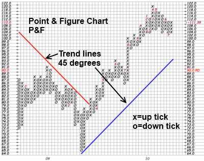
Example of a point and figure stock chart
Bottom Line
Point and figure charts have been described as one of the simplest methods for determining specific buy, or entry, and sell, or exit, points. These charts are a way to visualize price trends and movements in a stock without regard to the amount of time that passes.
Point & figure charts are unique in that they do not account for the discrete passage of time as most other types of charts do along their x-axes. They cancel out all of the noise and give you quick information on how your stock is doing.
They are also simple to learn and interpret, and are an excellent tool for doing price target calculations.